Case study 03 / 03UX · UI · Design system

Marketplace Panel

Internal tool2026

An internal panel for a furniture seller who sells on many marketplaces at once: about 800 offers, several seller accounts and one question asked every morning, is this still earning money after fees and ads? I designed the panel's UX and UI and helped shape its structure. The project is private, so the shop, the people and every number on the screens are invented.

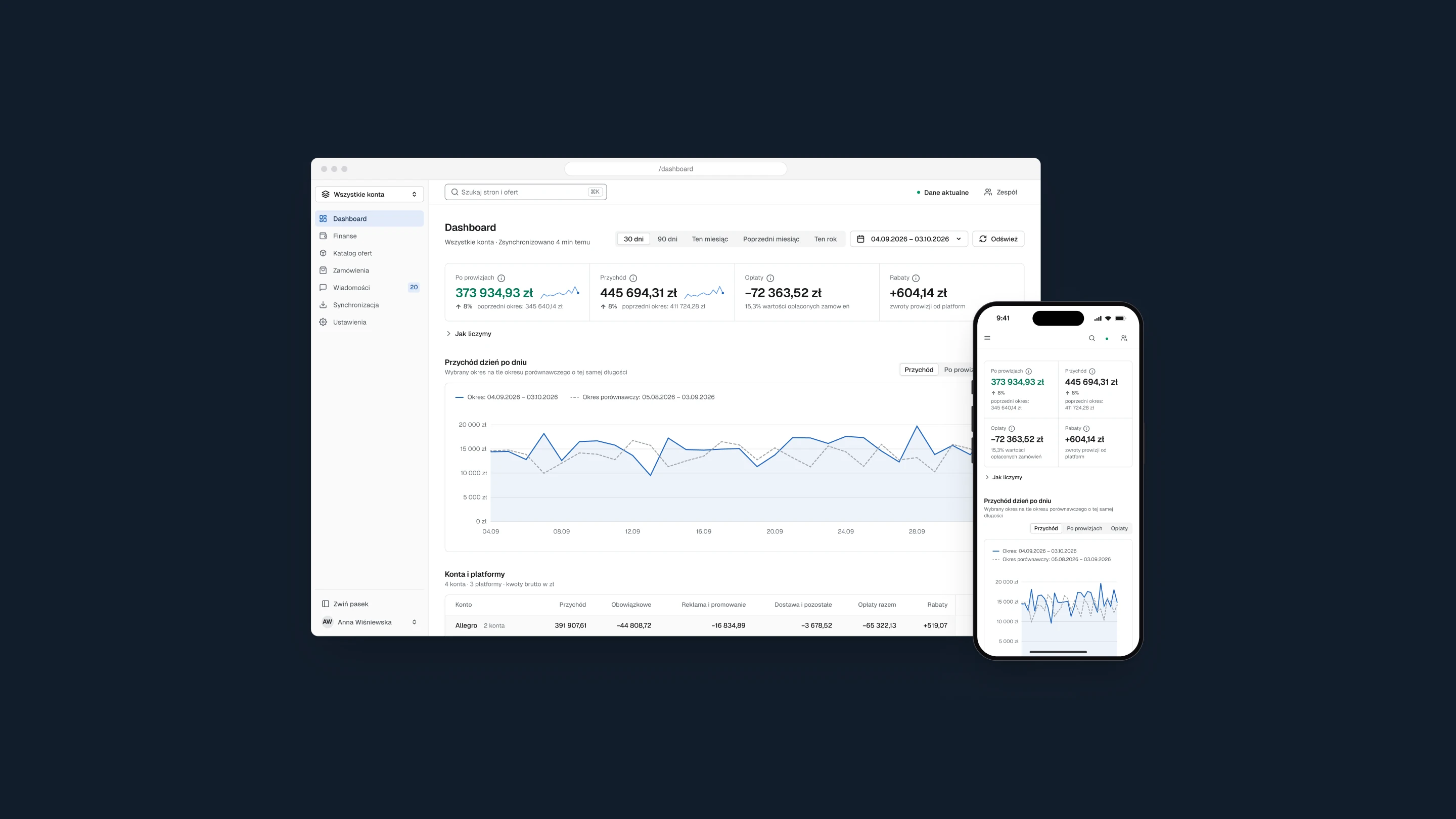
The panel's first screen in a browser window, with the result after fees, revenue day by day against the previous period and the accounts table, and the same screen on a phone, on a dark navy background

Client
Furniture retailer
My role
UX/UI design, product structure
Timeline
April to October 2026
Scope
Seven sections on desktop and phone / Design system / User flows

(01)

The project

Context

The seller lists furniture on many marketplaces at once, from several seller accounts. Each marketplace has its own panel, its own fees and its own words for the same order status, and each one reaches the panel through its own API. With that many integrations behind it, the simplest question, how did we do this month, had no single place to be answered.

I designed the panel that answers it in one place: sales, fees and the result after fees for every account and every offer, orders from every marketplace in one list and buyer messages in one inbox. My part was the UX and the UI: how each screen reads, what it asks of the person using it and what it says when a number is missing. I also helped decide how the panel is put together: which sections it has, and what the owner, the managers and the staff each get to see.

The project is private and nobody outside the company can log in. That is why the shop, the buyers and the figures here are invented, and why many parts of the panel are not shown.


(02)

The problem

Problem

One question, is this offer still earning after fees and ads, had its answer scattered across every marketplace's own panel.

A commission is charged when an order is paid, revenue only counts once the parcel ships, ads are billed days later and the sales they bring sit in yet another panel. Every marketplace reports all of this through its own API, in its own format and at its own pace. Put together carelessly, those numbers lie: a fee shows up before its revenue, an estimate looks like a fact, a missing figure reads as zero. Before the panel could be useful, it had to be honest about every number on it.

Constraints

  • Many marketplaces and many API integrations, one set of words
  • Every number has a source, and no estimate passes for a fact
  • Three roles: the owner, managers, and staff who see no finances
  • Every screen works on a phone too

(03)

Key decisions

Decisions

Read is not the same as answered

Context
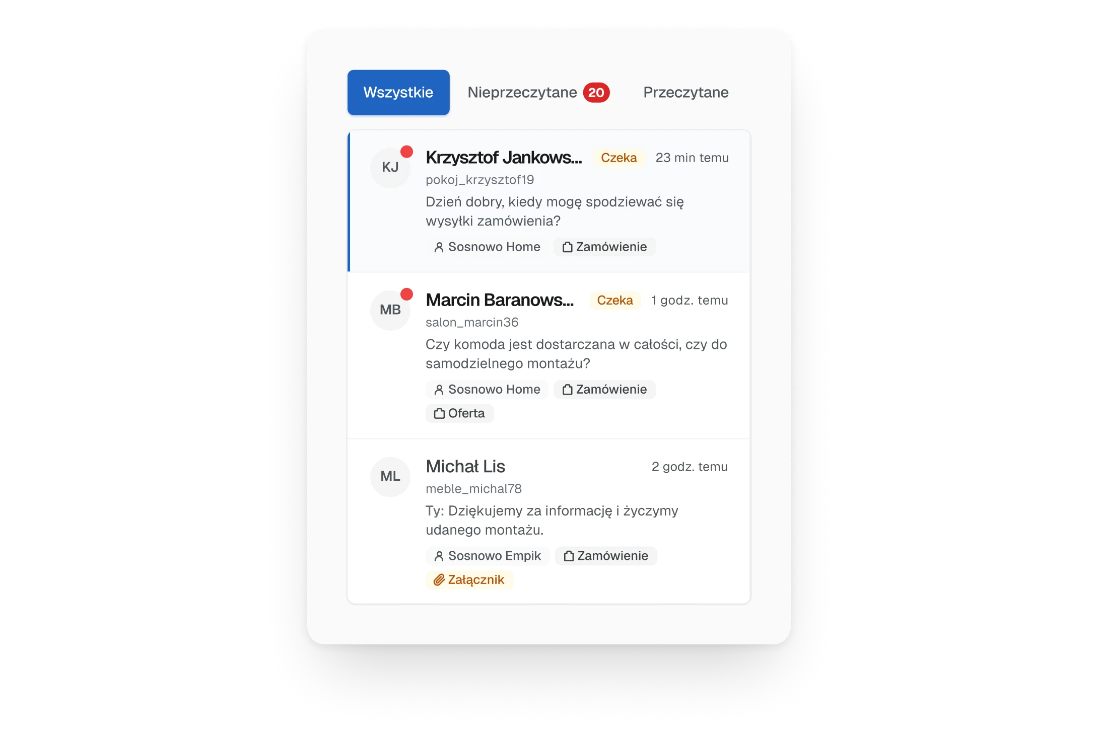
Buyers write about deliveries, missing parts and invoices, and a slow answer costs a rating. The old inbox opened the newest thread by itself and marked it read, so a message could turn read without anyone reading it, and a read message looked dealt with even when nobody had replied.
Decision
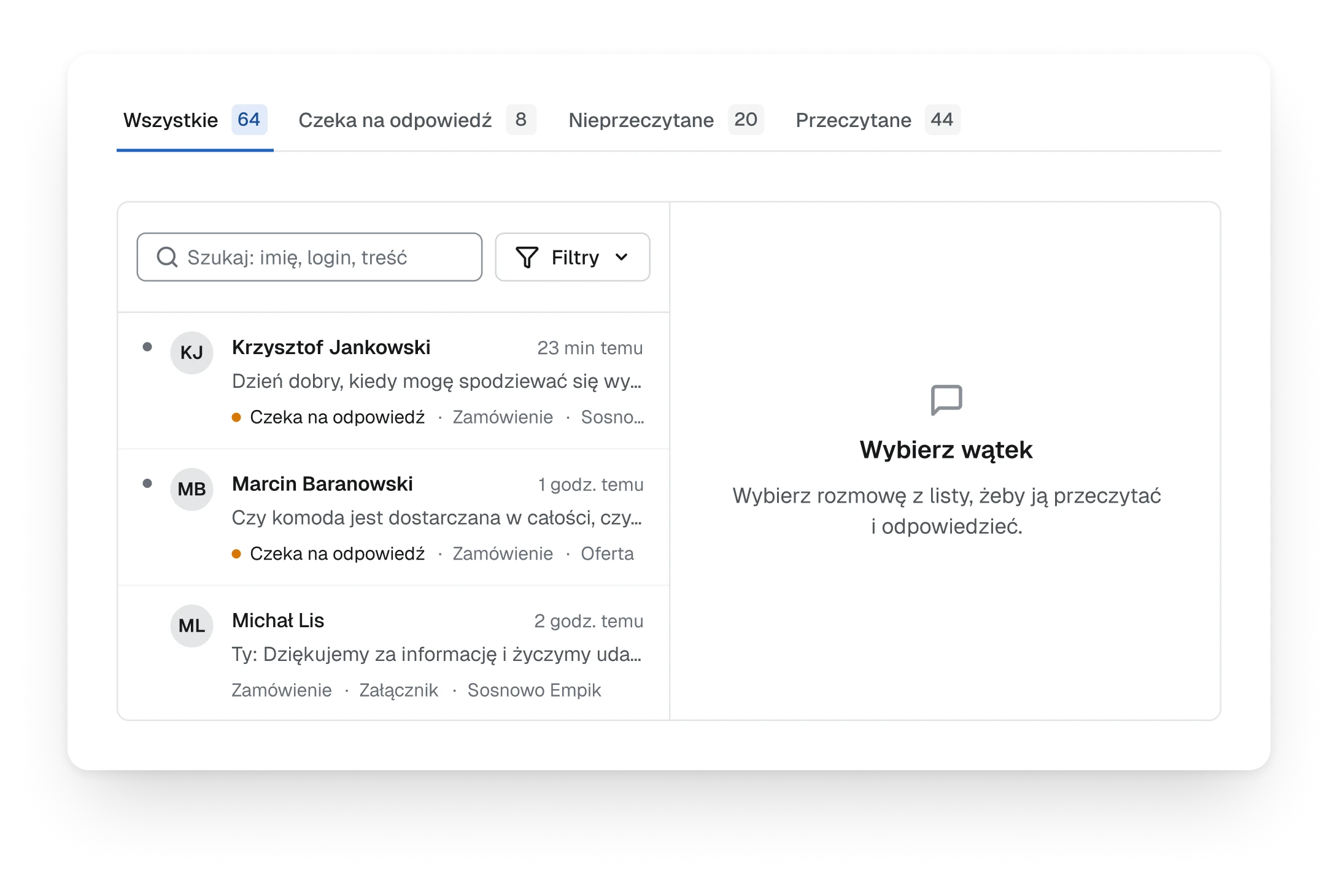
Nothing opens on its own any more. A thread turns read only when someone opens it, a thread marked unread stays unread, and the open thread lives in the address, so a link from the first screen lands right on it. Next to unread, the inbox now counts what is waiting for a reply: every thread where the buyer had the last word, whether or not someone has glanced at it.
Trade-off
One more click before the first message. Choosing which buyer to answer first is always someone's decision now, never the inbox's.
The old inbox, three filter buttons with a red count on unread, and a list of threads where the newest one is already open and marked
Before
Fig. 01The newest thread opened itself and turned read. The only filter was unread.
The new inbox, tabs for all threads, waiting for a reply, unread and read, each with a count, a list where threads waiting for a reply are marked, and an empty reading pane that asks to choose a thread
After
Fig. 02Nothing opens until it is chosen, and waiting for a reply has its own tab.

Every colour has one job

Context
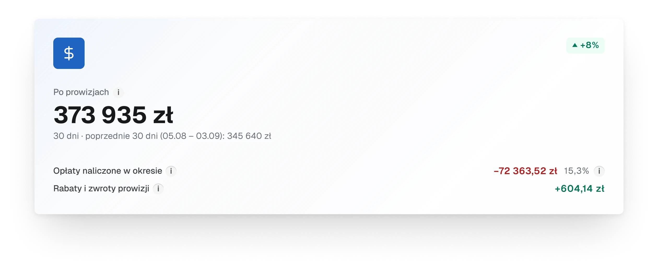
The old first screen coloured almost everything: fees in red, changes in red and green badges, a blue tile behind every icon. The commission, a cost nobody can avoid, was the reddest thing on the screen, so the eye learned to skip red.
Decision
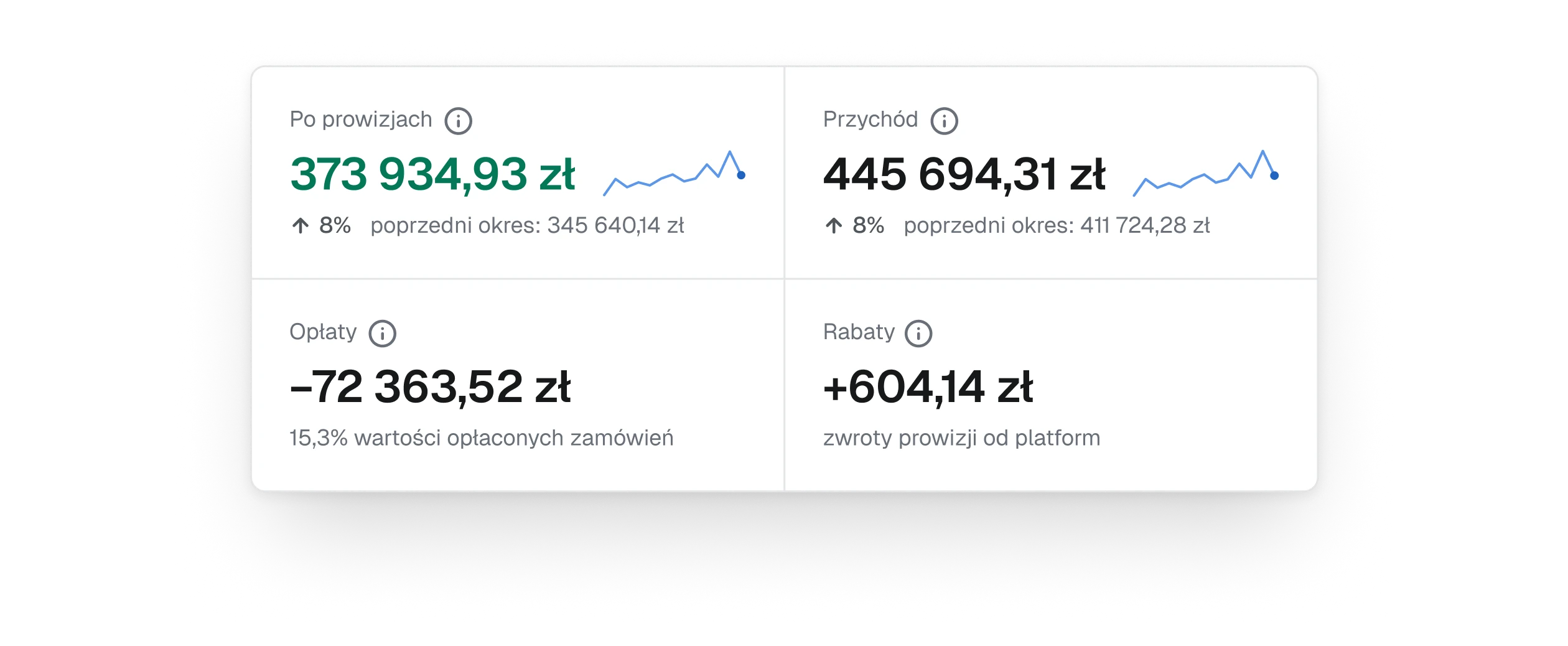
Each colour now means one thing. Green and red belong to a single number, the result after fees, and only when it comes from the marketplaces' own billing. Amber marks what is waiting for someone. The brand blue says where you are and what is selected: the current section, the active tab, the chosen thread, the trend line. Fees carry a minus sign instead of a colour, and changes in the period are grey.
Trade-off
An estimated result stays grey even when it looks good. The panel would rather say less than say something it cannot back.
A large card from the old first screen, the result after fees with a blue icon tile, a green change badge, fees in red and rebates in green
Before
Fig. 03Red for fees, a green badge and a blue tile on one card.
The four figures of the new first screen as a block of two by two, the result after fees in green with a small blue trend line, revenue with its trend line, fees as a negative number and rebates
After
Fig. 04One coloured number, and blue only for the trend. Shown two by two, the way the strip folds on a narrow screen.

A missing number is never a zero

Context
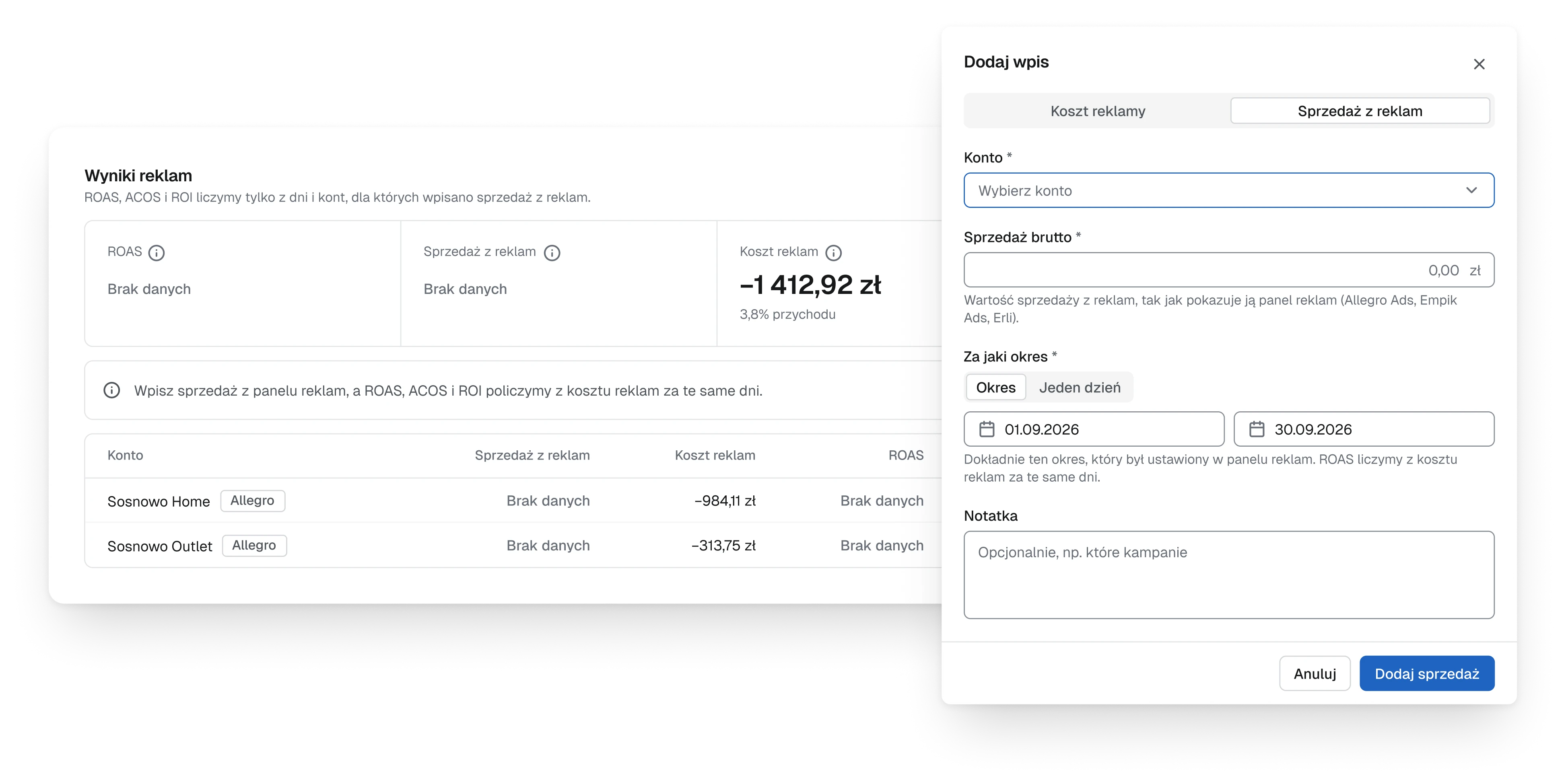
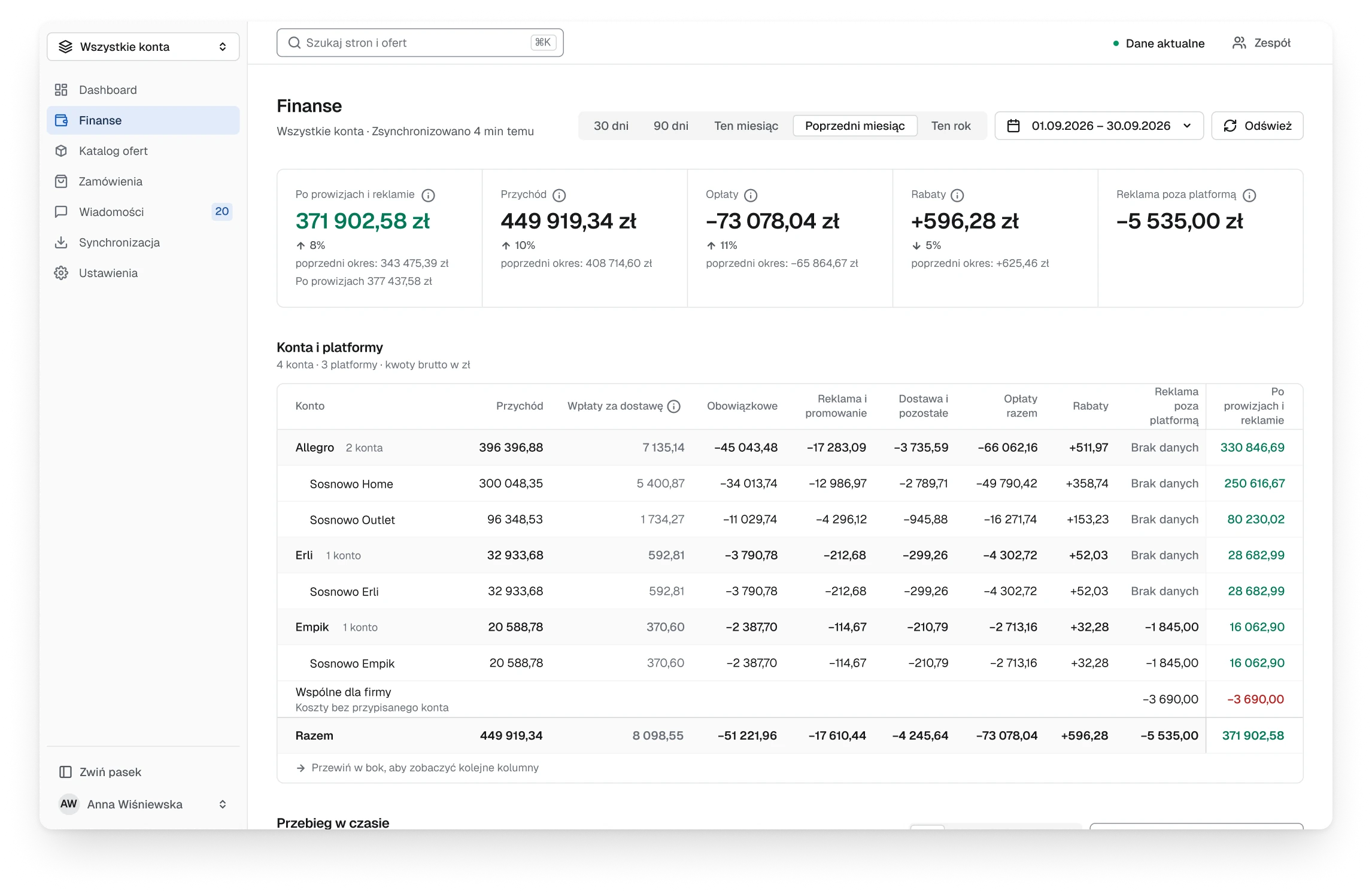
Sales brought by ads are not in any API the panel can read. They live in the marketplaces' ad panels and have to be typed in. Without them ROAS cannot be counted, and a zero in its place would read as a campaign that failed.
Decision
Where a number has no source, the panel says No data and names what it needs. ROAS is counted only from the days and accounts with sales entered, and the empty spot itself opens the form for the missing entry, already set to ad sales and to the right account, instead of sending the owner to look for it further down the page.
Trade-off
Some cells say No data for days, until someone types the sales in. That is still more useful than a figure nobody can trust.
The ad results block with ROAS and ad sales marked No data and a note that says what to enter, and the entry form opened over it on the ad sales tab, with the account, gross sales and the period
Fig. 05No data names what it needs, and the form opens on the right kind of entry.

A setting that rewrites every number asks first

Context
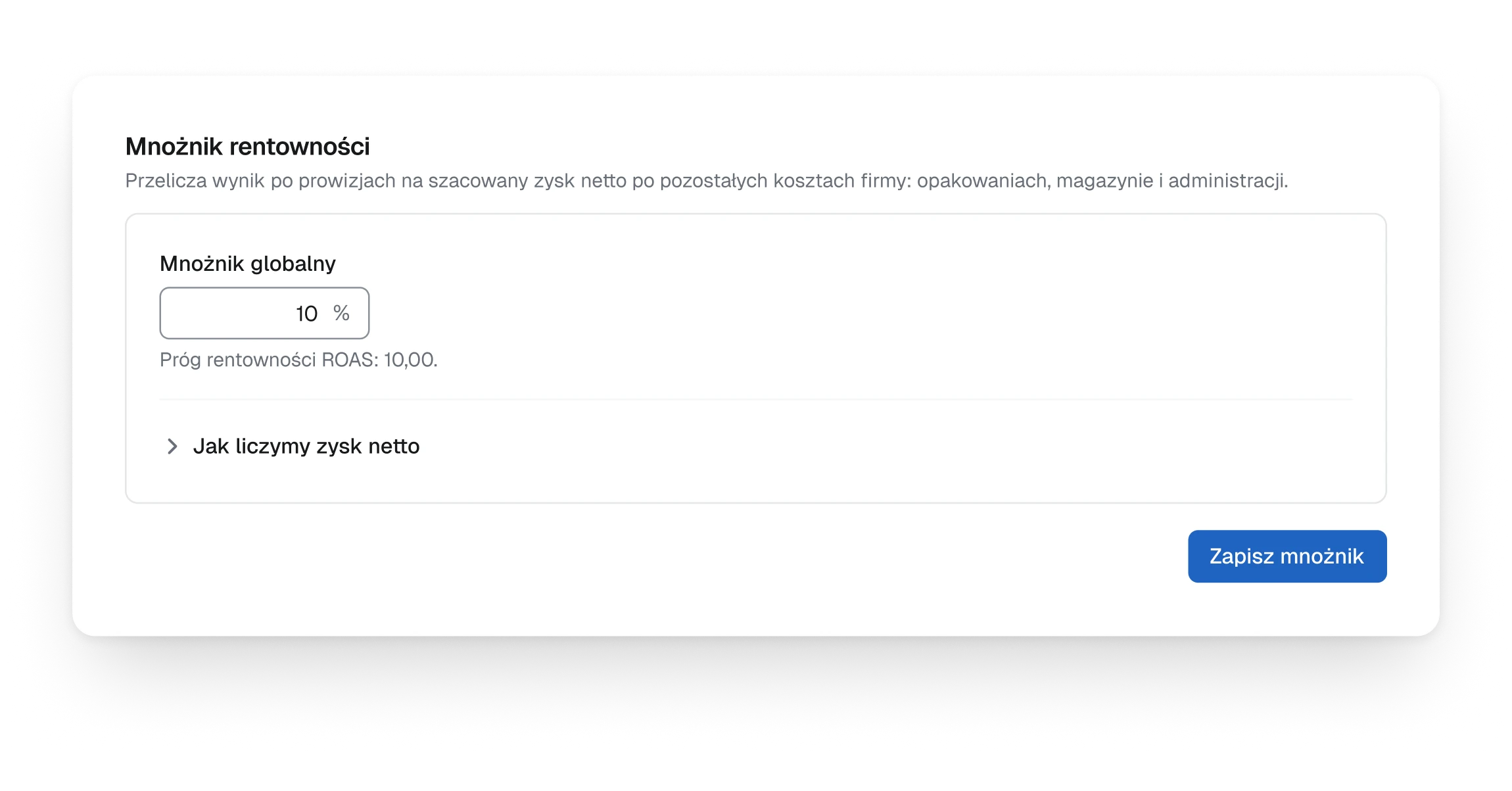
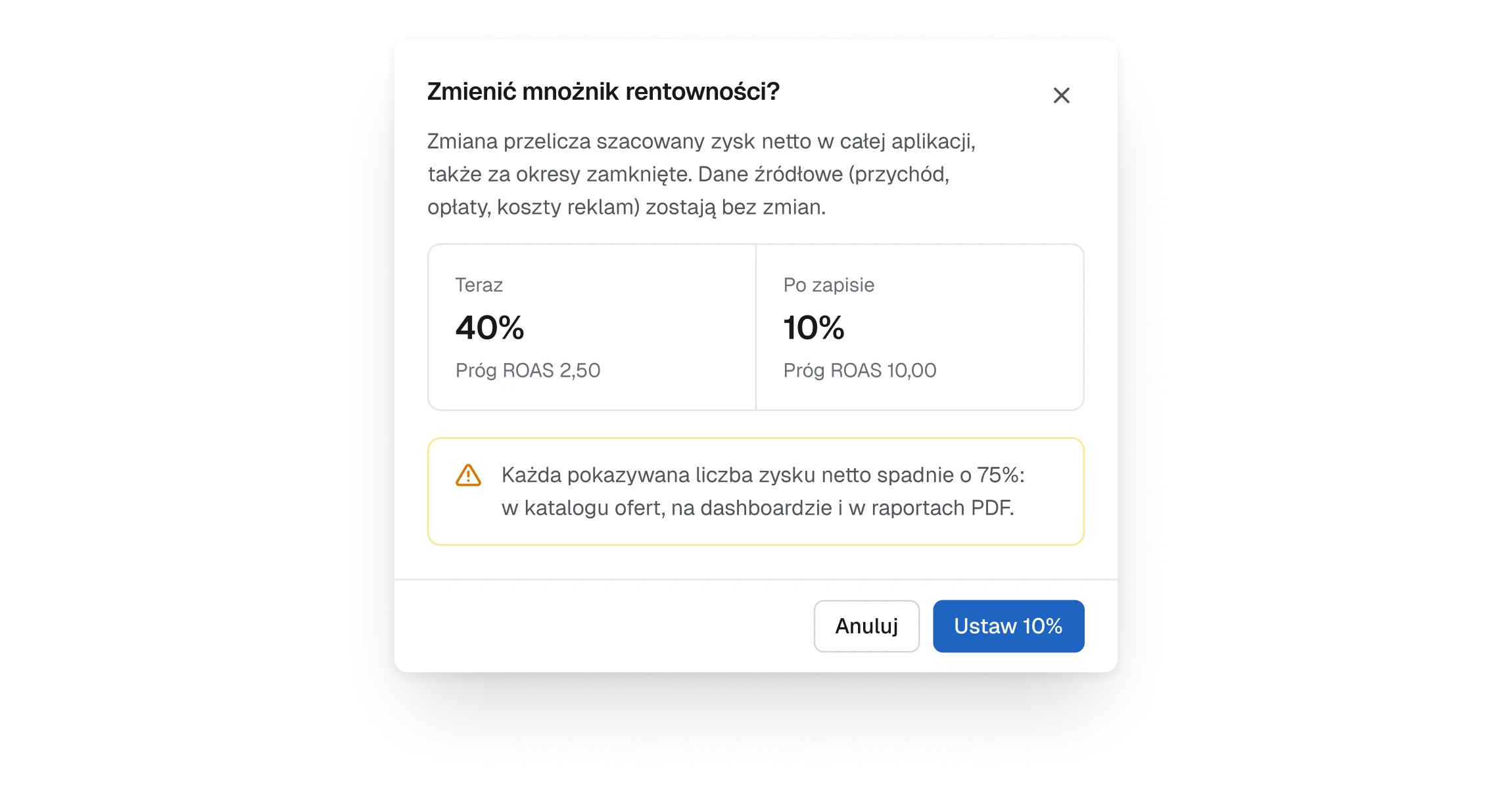
The profit multiplier turns the result after fees into an estimated net profit for the whole company. Changing it rewrites every profit figure in the panel and in the PDF reports, months already closed included, and a slip of one digit goes unnoticed.
Decision
Saving a new value opens a confirmation that shows the setting now and after the change, says in plain words what will happen, every net profit figure drops by 75 per cent, and puts the value on the button: Set 10%. Cancel is the first choice, and the old value can be restored afterwards.
Trade-off
One more step for a change made a few times a year. That is the point of it.
The profit multiplier setting, a field with a new value of 10 per cent and a save button
Fig. 06The setting: one field that changes every profit figure in the panel.
The confirmation, 40 per cent now and 10 per cent after saving, a warning that every net profit figure will drop by 75 per cent, a cancel button and a button that reads Set 10%
Fig. 07What saving it asks: now and after, the effect in words, the value on the button.

A list says what is in it before anyone clicks

Context
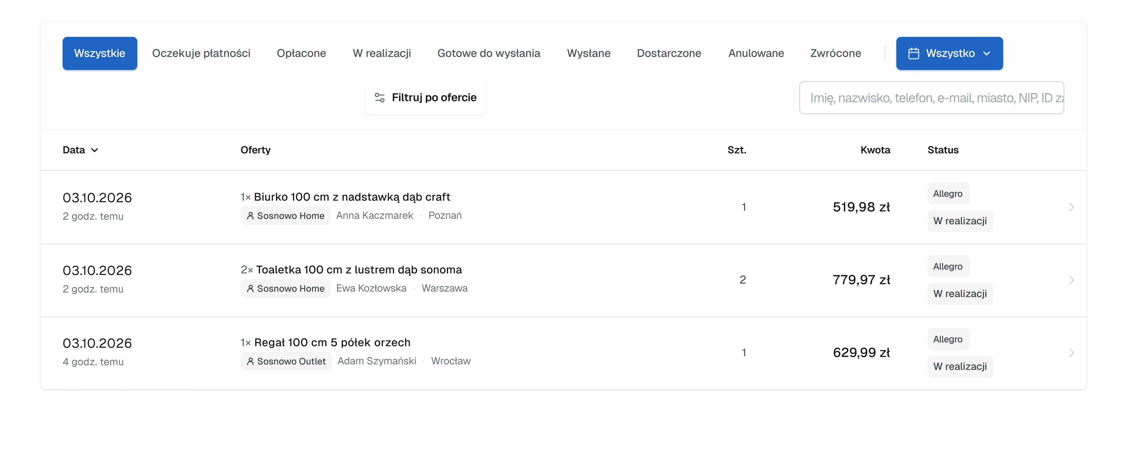
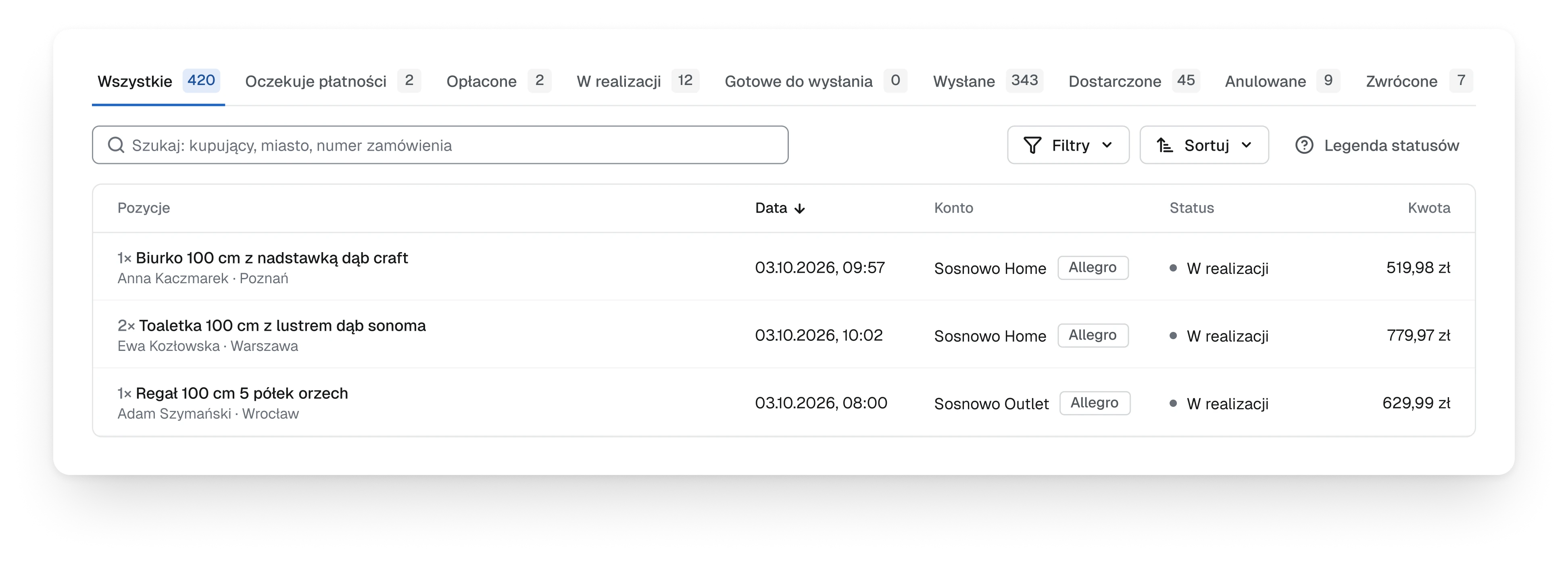
The order list had nine status tabs and no numbers on them, so finding out whether anything was waiting for payment meant opening the tabs one by one. The offer catalogue opened sorted by price, with the most expensive offer on top whether or not it had ever sold.
Decision
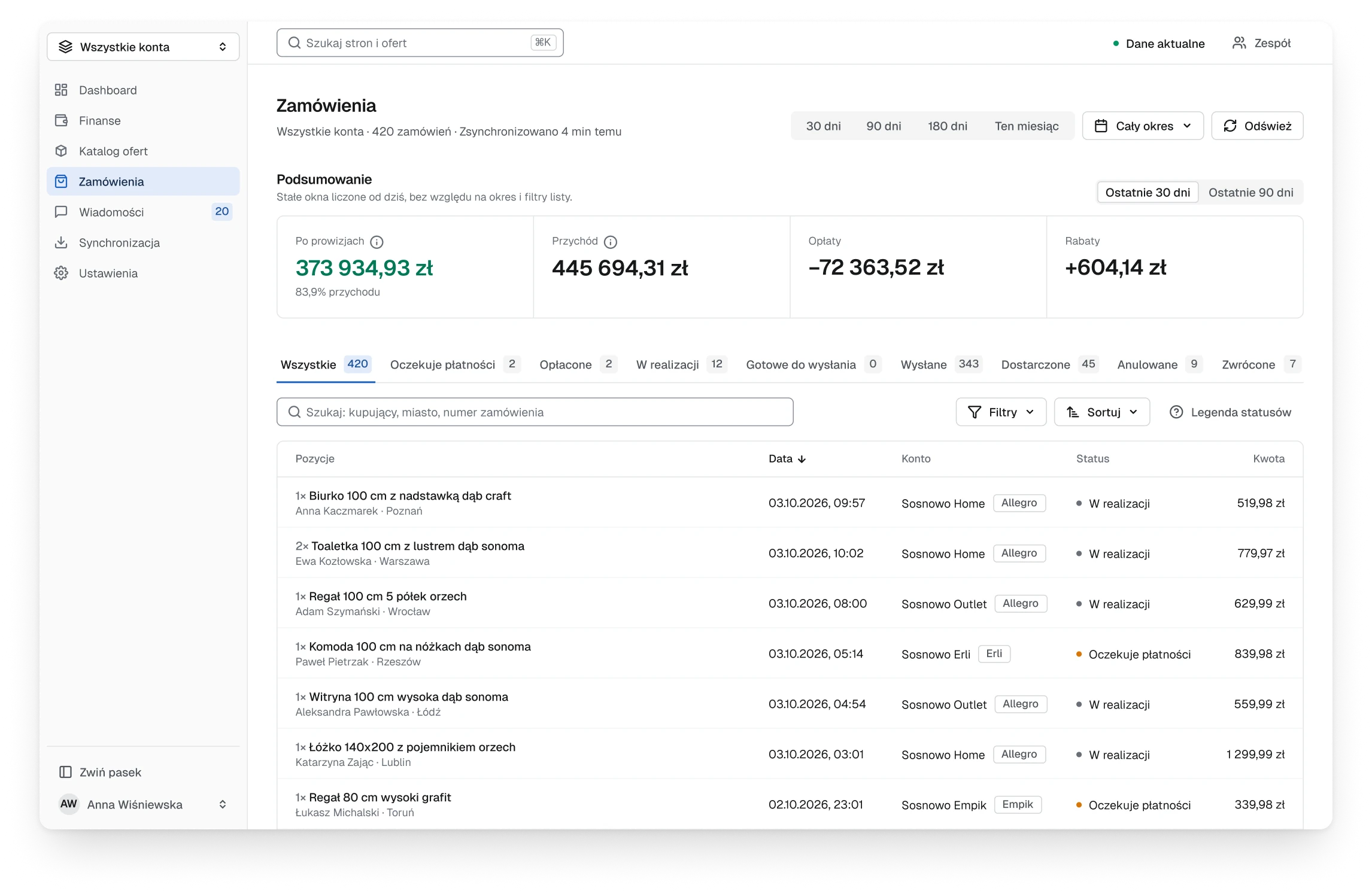
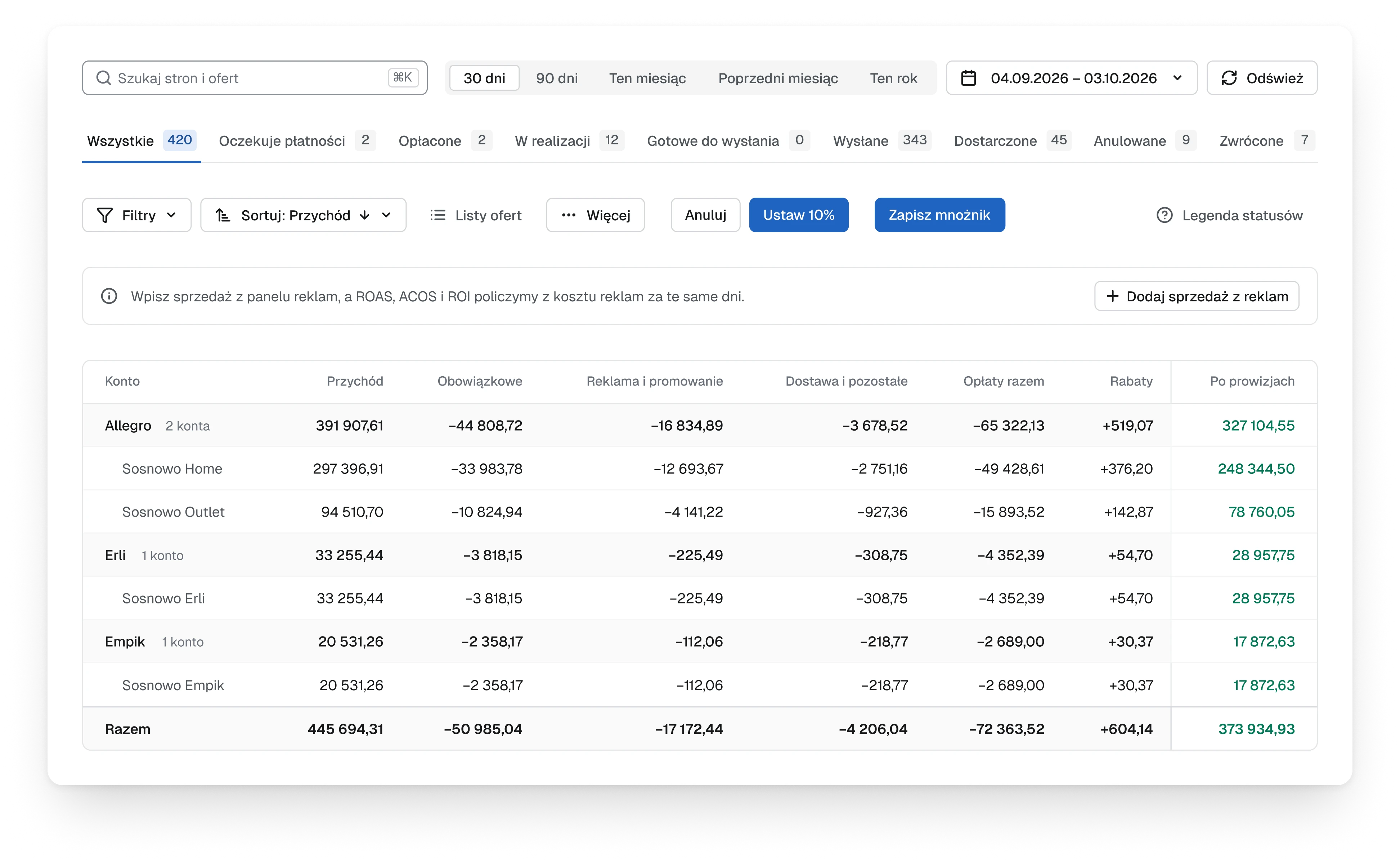
Every status tab now carries its count, zero included, so an empty tab is never opened just to check, and the row of tabs doubles as a summary of the day. The catalogue opens sorted by revenue from the last 30 days, so the first screen shows what sells, and offers that sold nothing sit in a tab of their own, with their number on it.
Trade-off
Nine counters make the row of tabs busier, and a zero is shown as plainly as a hundred. Hiding the empty tabs would be calmer, but tabs that come and go are harder to learn.
The old order list, nine status tabs without numbers, a date button, a filter button and a search field on a second line, and three tall rows with the date, the offer, the amount and two status badges
Before
Fig. 08Nine status tabs and not one number on them.
The new order list, nine status tabs each with its count, a search field, filters and sorting, and the first three orders with date, account, status and amount
After
Fig. 09Every status with its count, zero included.

(04)

Design

Visuals

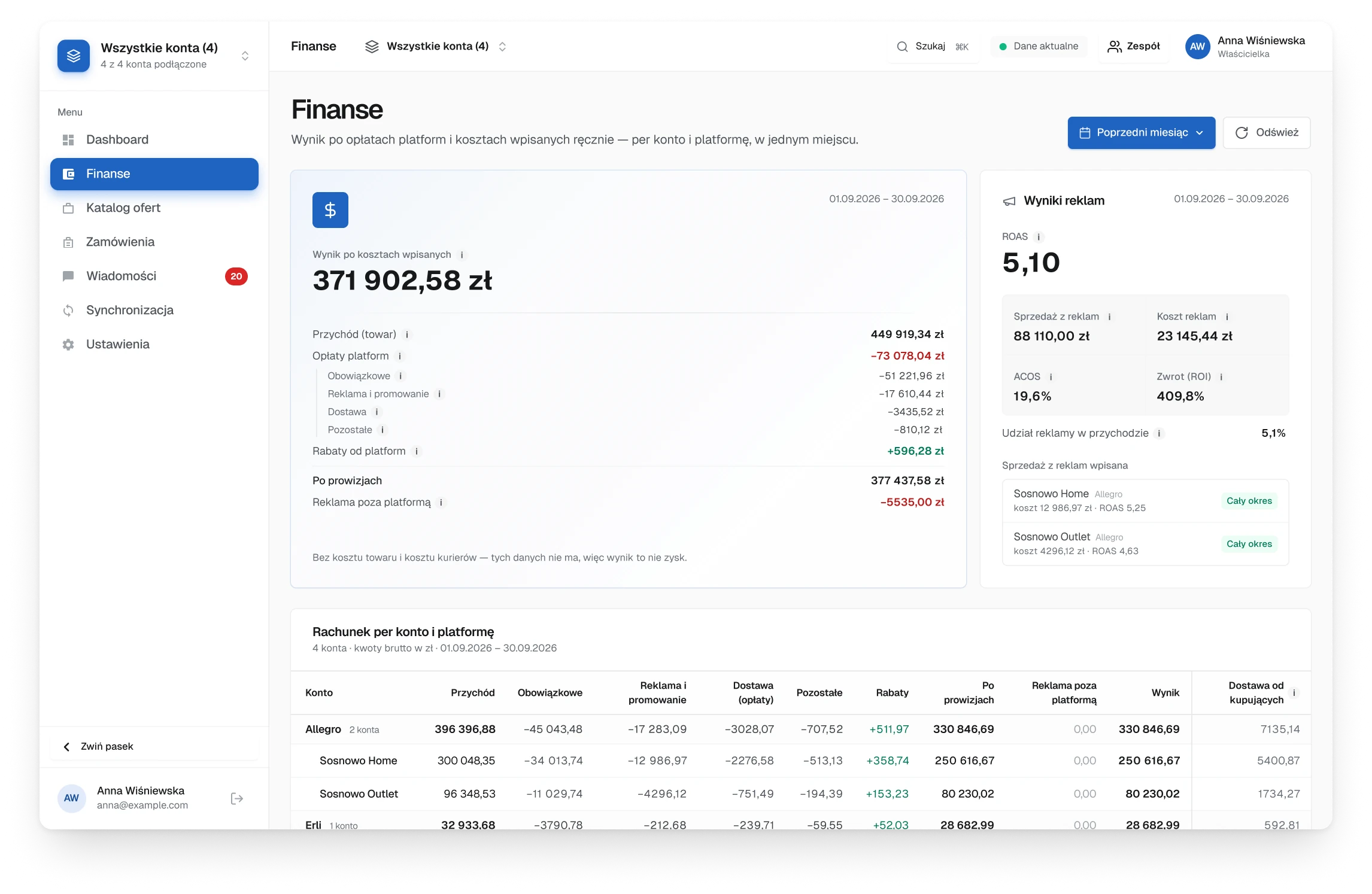
The old finance screen, the result as a long card of stacked lines with fees in red, an ad results card beside it and a wide table below
Before
Fig. 10Finance read like a receipt: one long card of lines, with the fees in red.
The new finance screen, five figures in one strip and the accounts table with fee columns, where missing ad sales say No data
After
Fig. 11Five figures, then one table for every account. A missing number says No data.
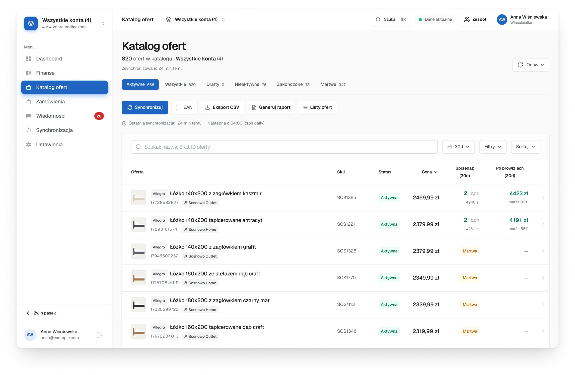
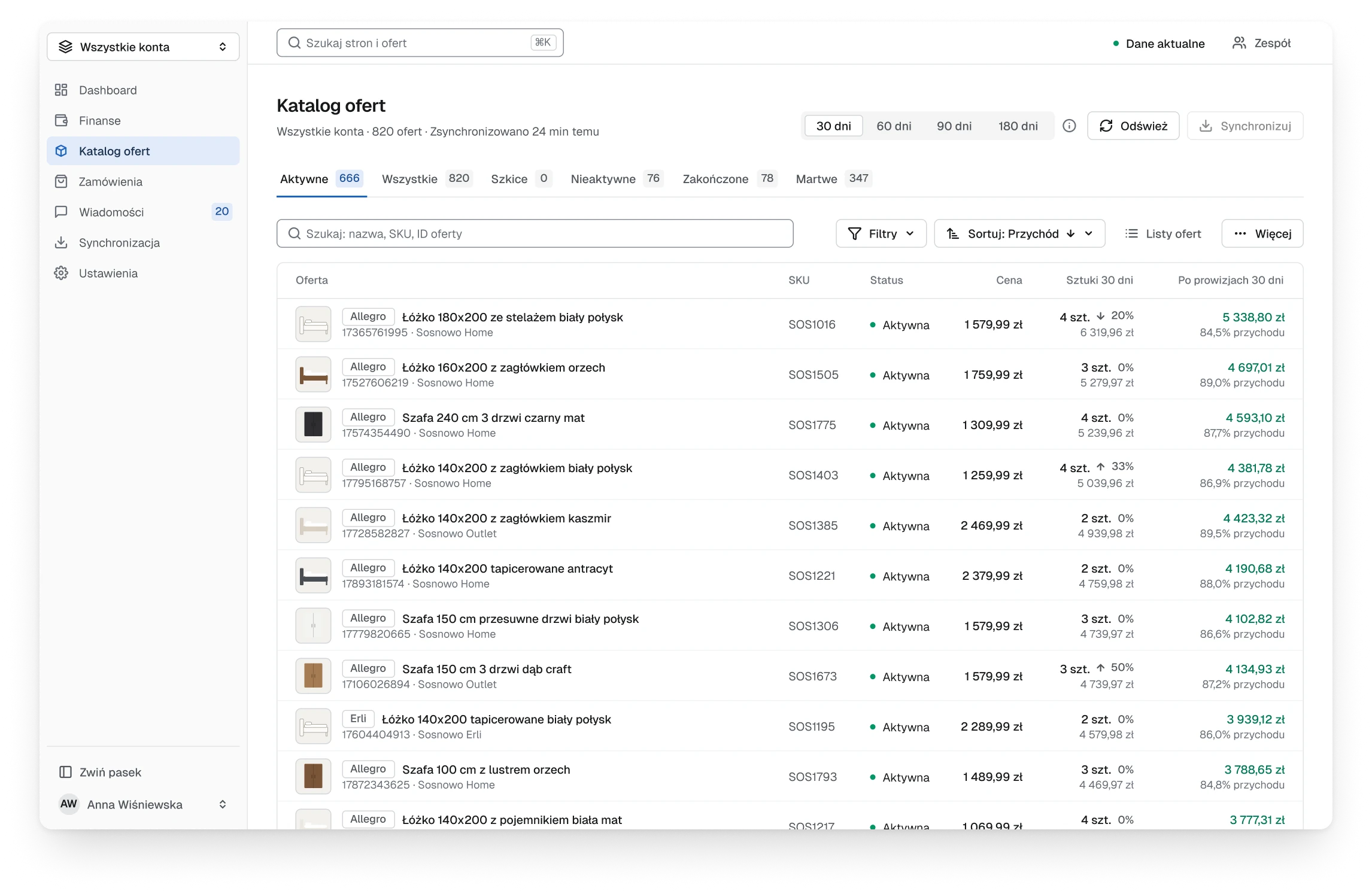
The old offer catalogue, a row of actions above the list, a search field, and tall rows sorted by price with coloured status badges
Before
Fig. 12The catalogue: a row of actions above the list, and offers sorted by price.
The new offer catalogue, tabs with counts, one toolbar with search, filters and a sort set to revenue, and more rows in view
After
Fig. 13One toolbar, actions folded into a menu, and offers sorted by what they earn.
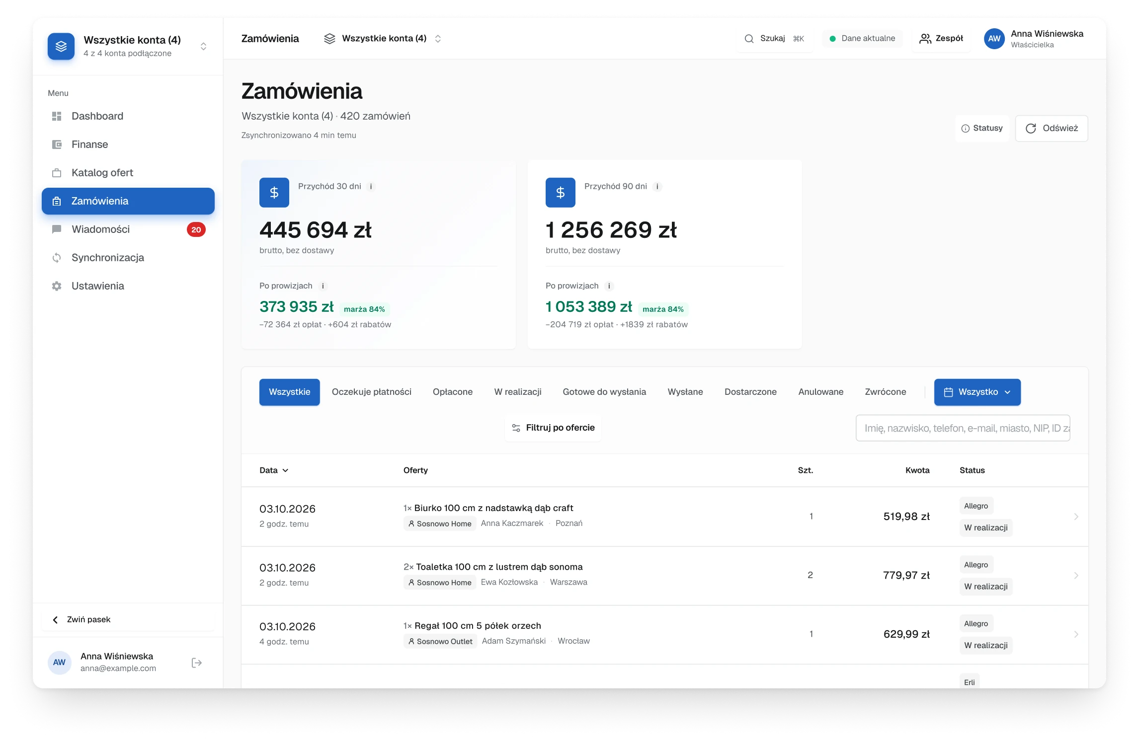
The old order screen, two large revenue cards above the list and three tall rows in view
Before
Fig. 14Two revenue cards pushed the list down: three orders in view.
The new order screen, one strip of four figures, status tabs with counts and seven orders in view
After
Fig. 15One strip of figures, counted tabs and seven orders in view.
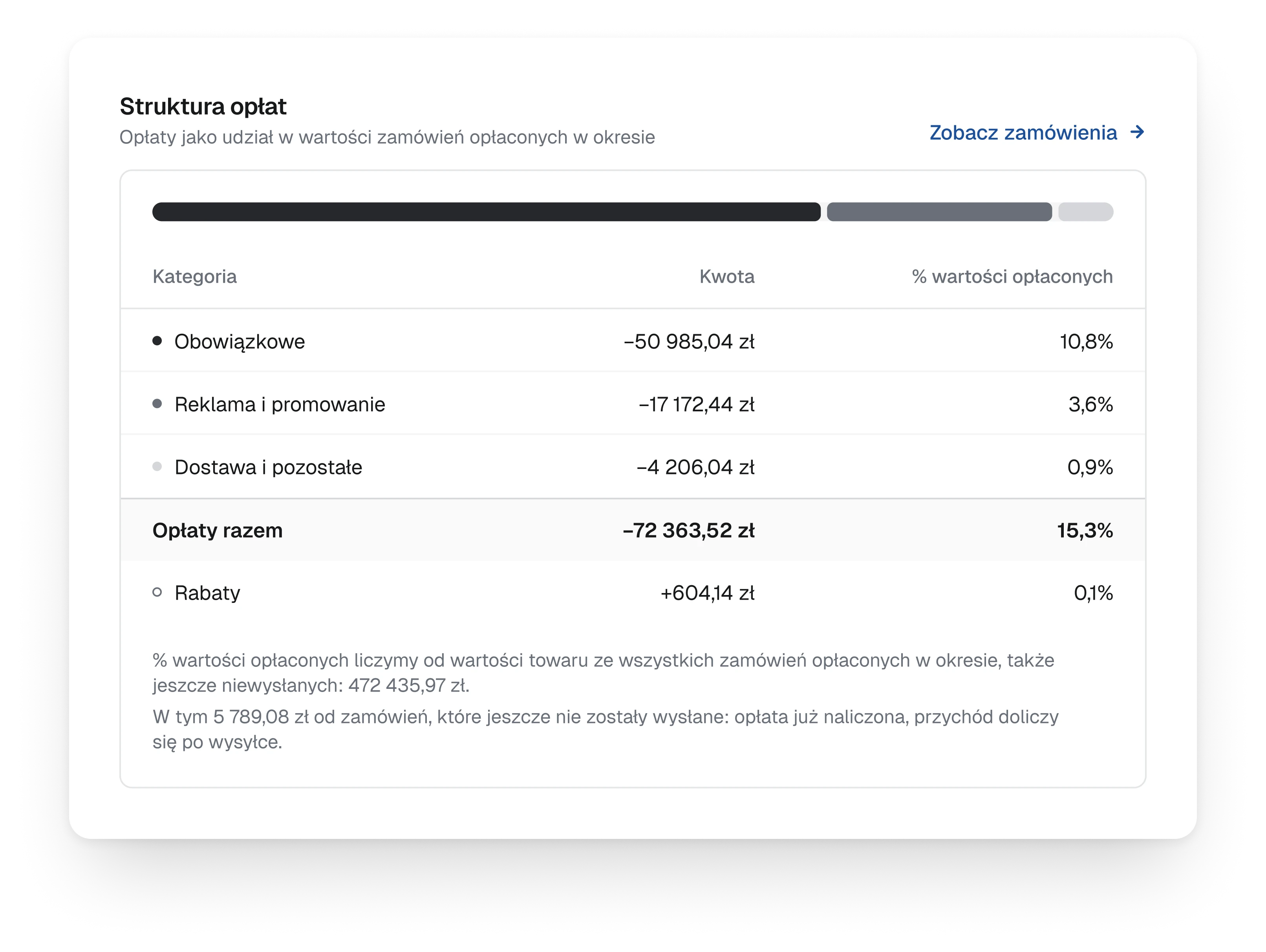
The fee structure, a grey bar split by kind of fee and a table with the amount and the share of each kind, a total and rebates
DetailFees without alarmWhat the marketplaces charge is a cost of selling, not a failure, so its breakdown is a neutral bar with a table under it: commissions, ads and delivery as shares of the paid orders. A footnote says how each share is counted.
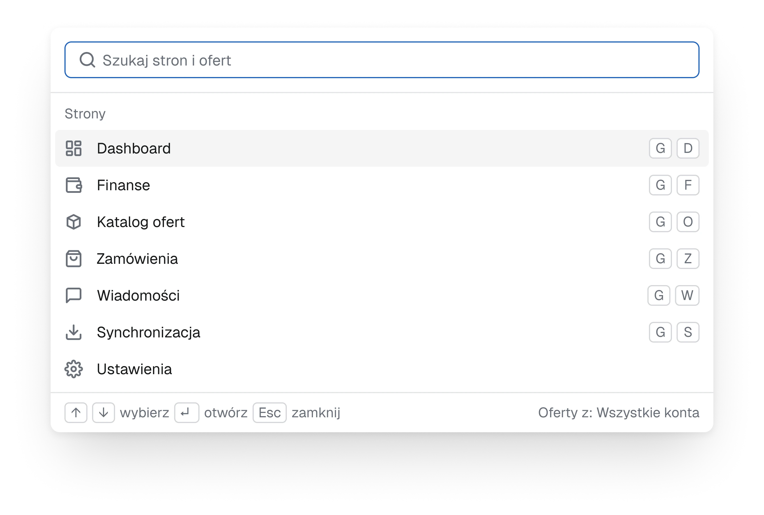
The command palette with a search field and the list of sections, each with its G and letter shortcut
DetailCtrl KEvery section and every offer is a few keys away. The palette lists the sections with their shortcuts, G and a letter, and starts finding offers from the second character typed.
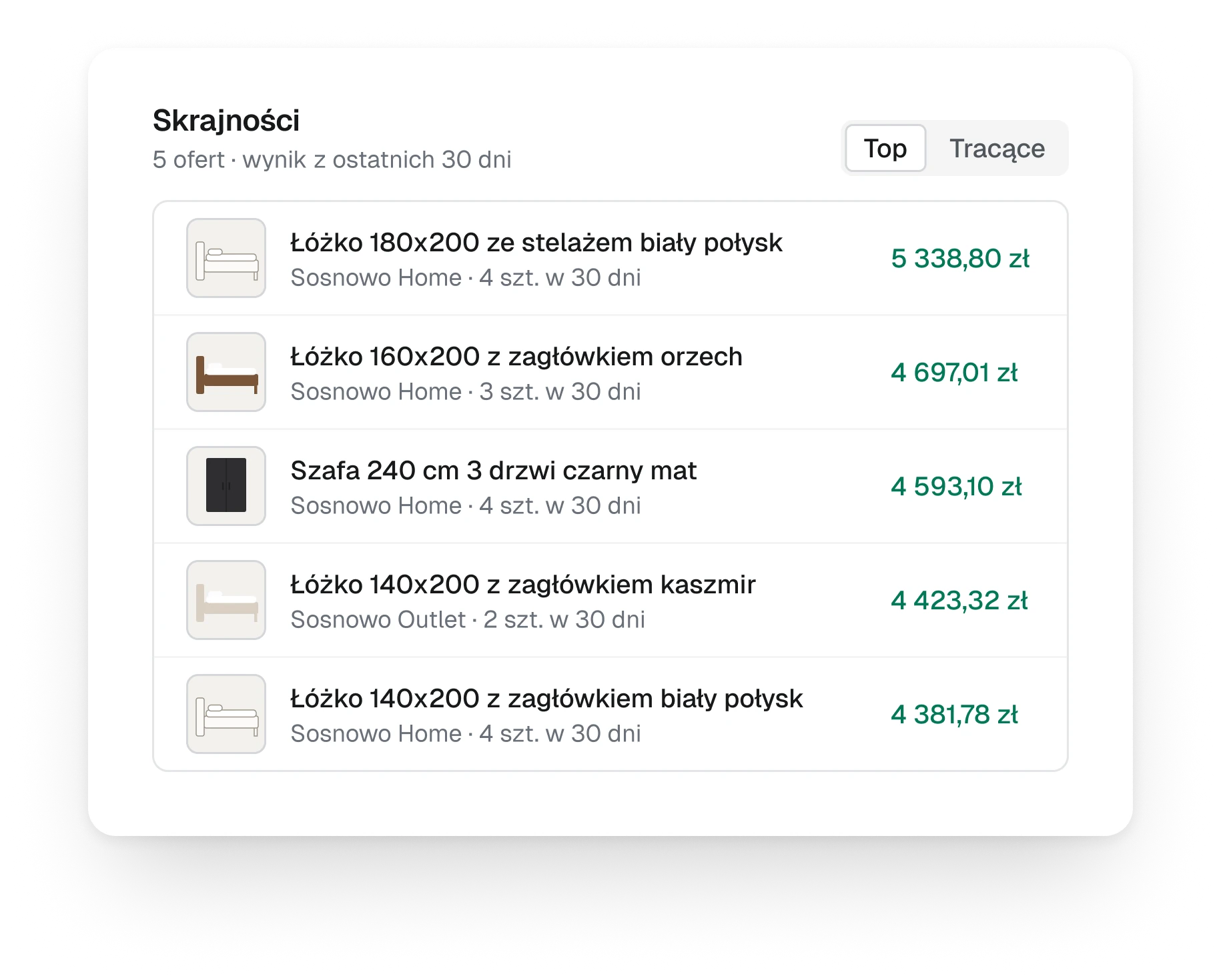
The best offers card, a switch between top and losing offers and five offers with a thumbnail, the account, units sold and the result after fees
Fig. 16Best and worst offers by result, one switch apart.
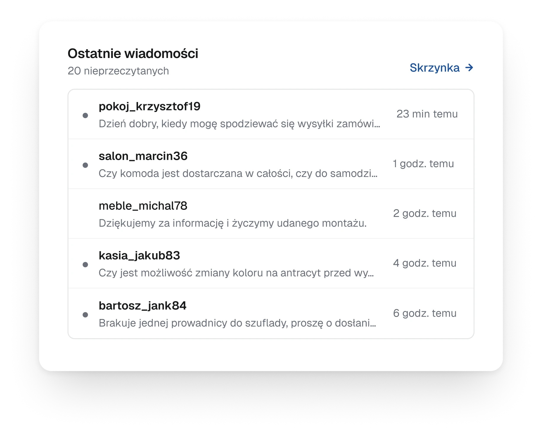
The latest messages card, five buyer threads with the login, a one-line preview and the time, and a link to the inbox
Fig. 17The latest buyer messages, straight on the first screen.
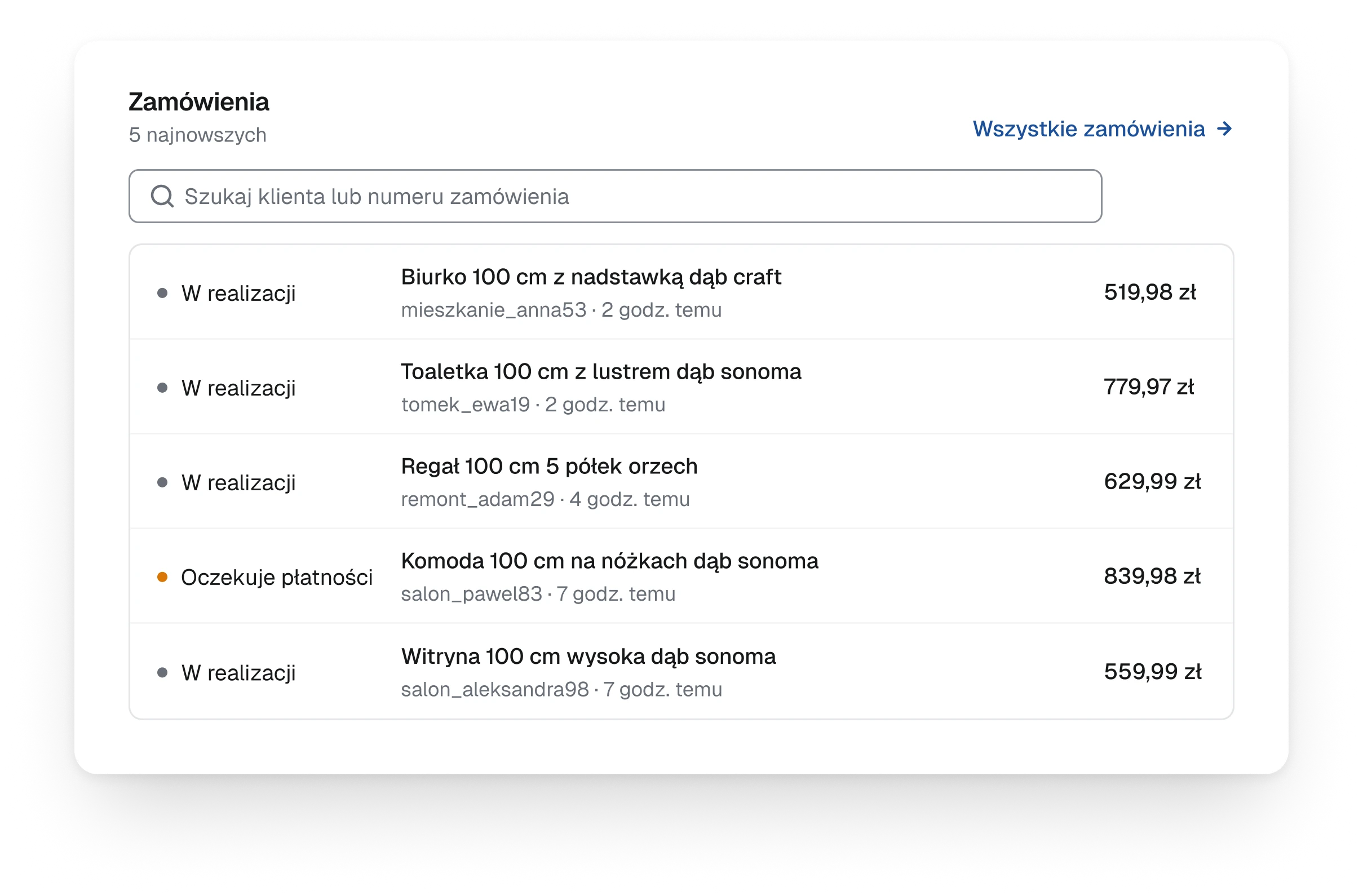
The latest orders card, a search field and five orders with a status dot, the product, the buyer and the amount
Fig. 18The five newest orders, with a search that goes to any order.
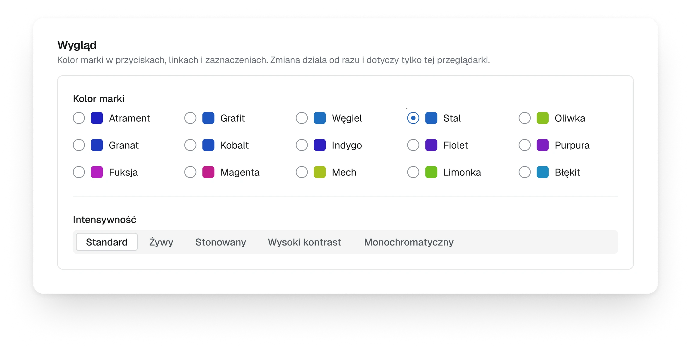
The appearance setting, fifteen accent colours as radio buttons with one selected, and a segmented control for intensity
Fig. 19Each person picks the accent colour and its intensity, for their own browser only.
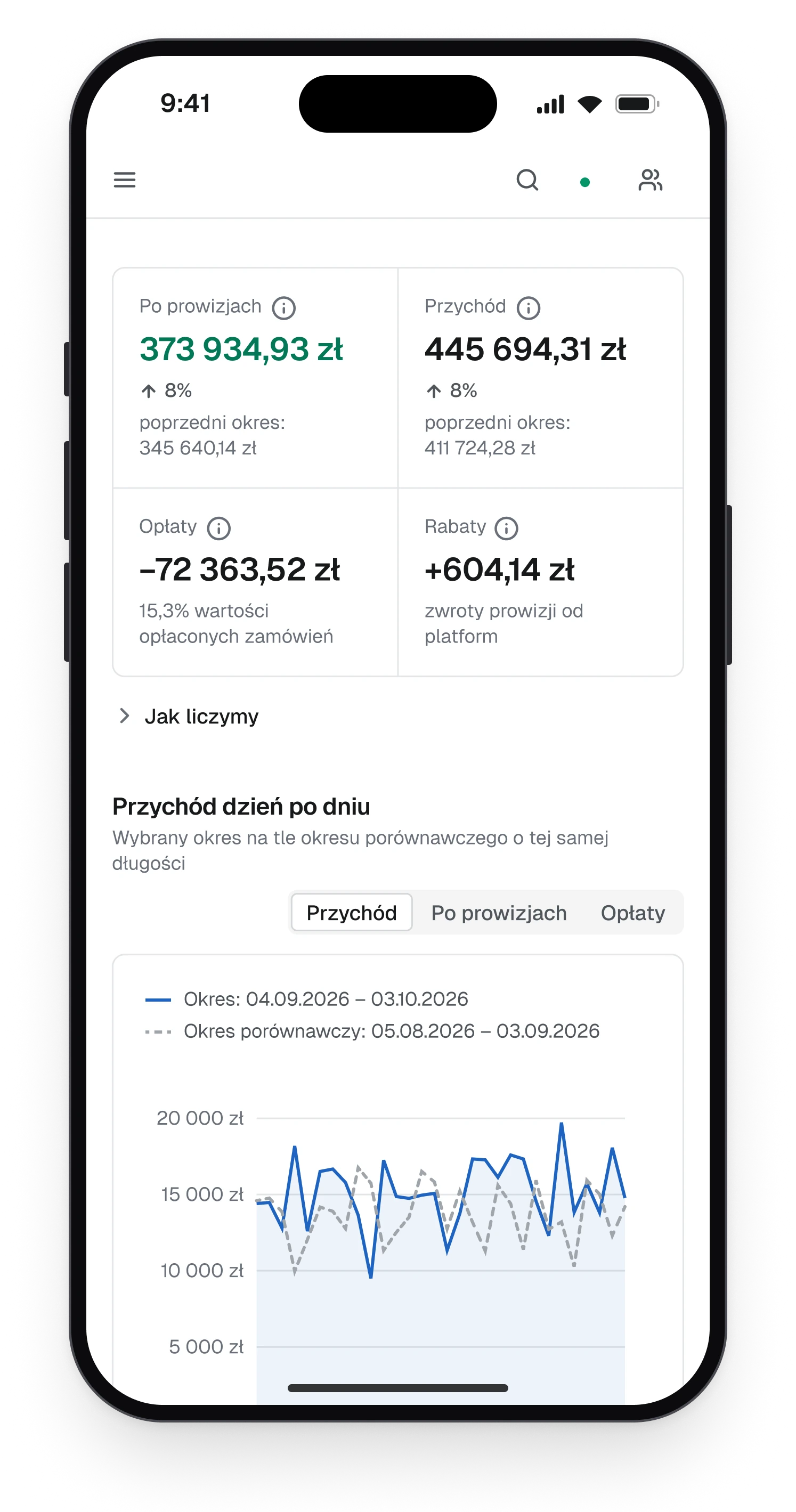
The first screen on a phone with four figures in two rows and revenue day by day below them
Fig. 20The first screen on a phone.
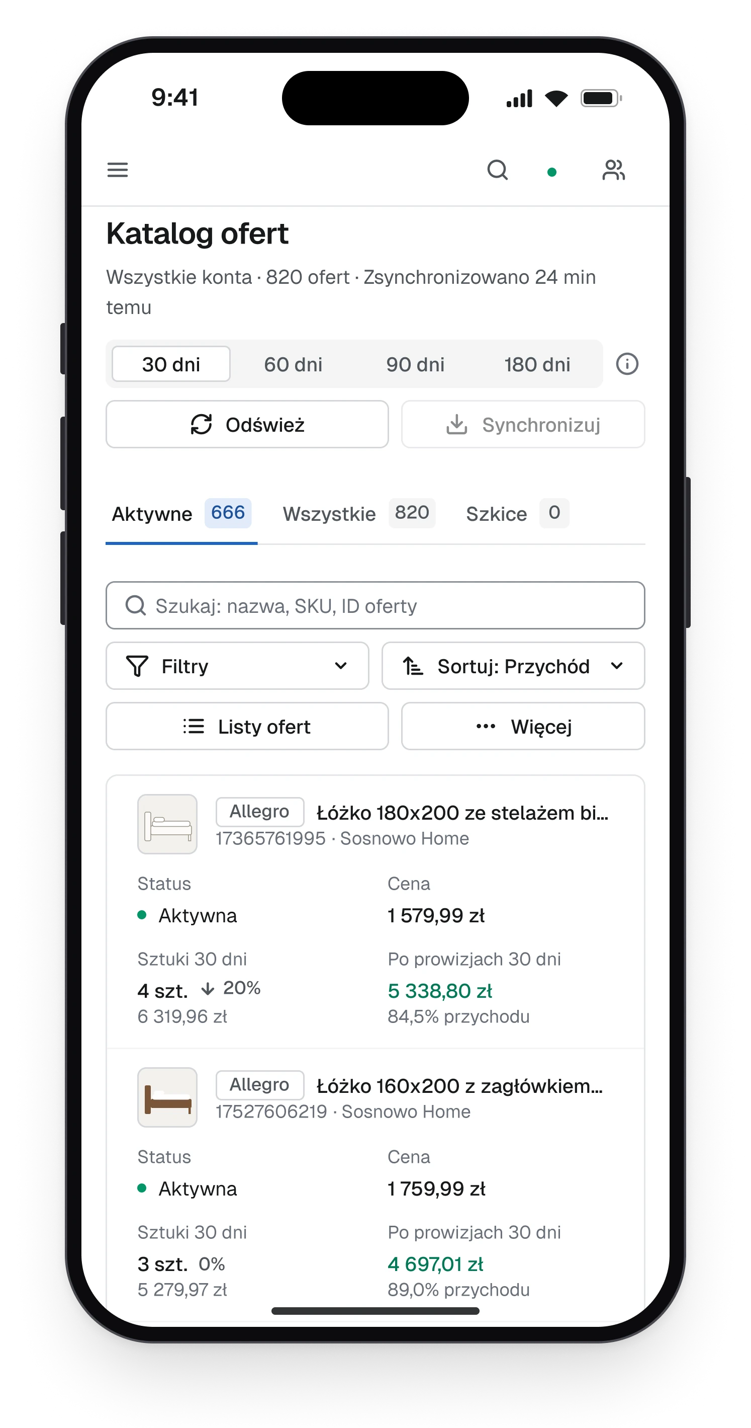
The offer catalogue on a phone, each offer as a card with status, price, units sold and the result after fees
Fig. 21Tables turn into cards.
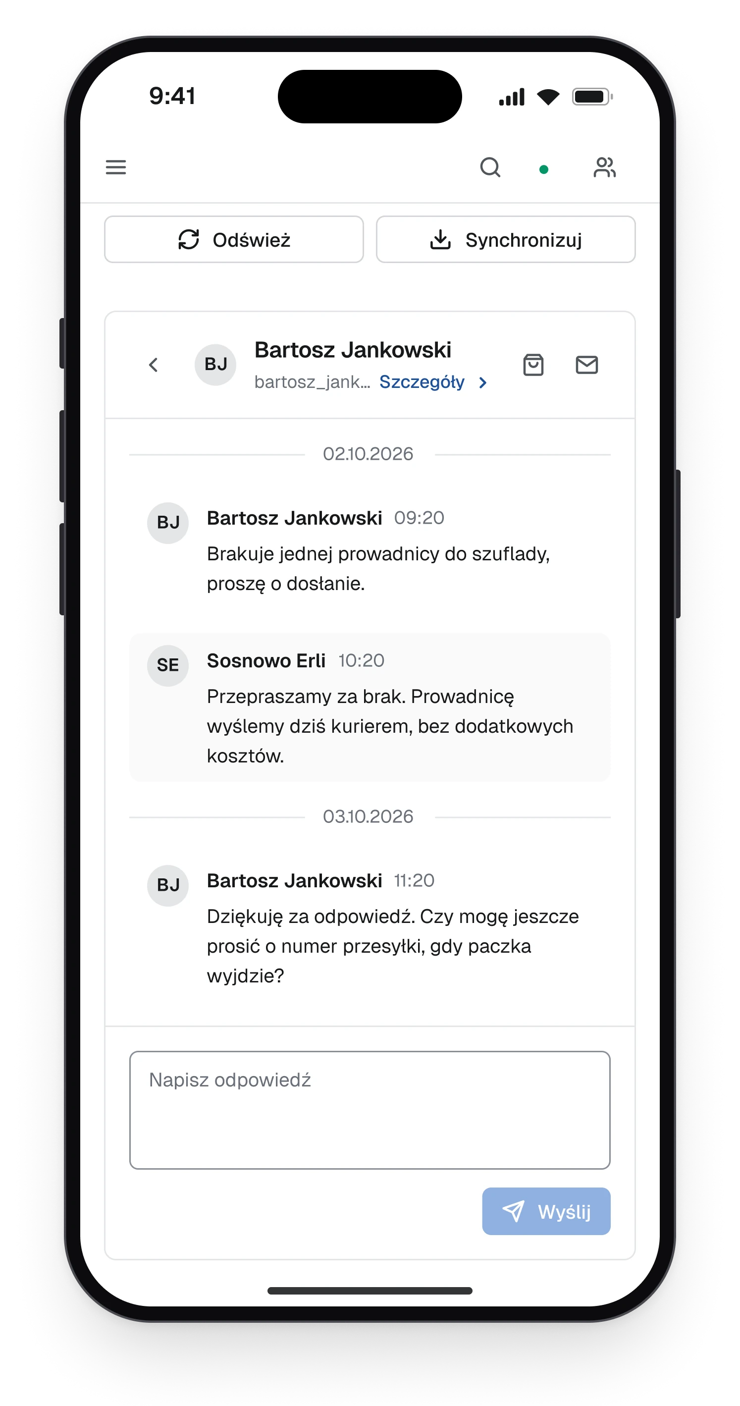
A conversation with a buyer on a phone, the buyer's question about a missing part and the shop's answer
Fig. 22One conversation at a time.

The whole file

  • 14screens, desktop and phone
  • 169components
  • 17areas with user flows
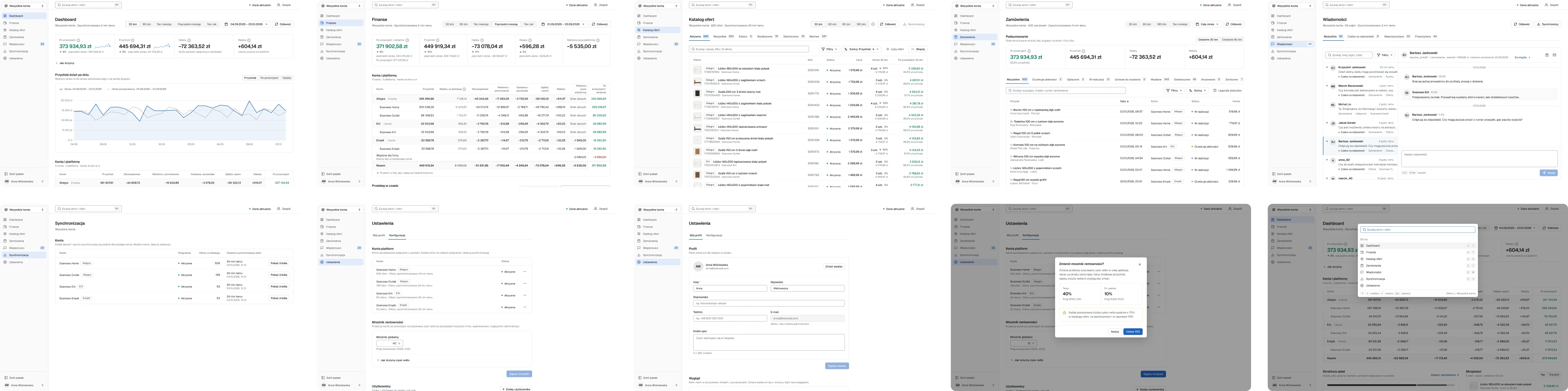
Ten desktop screens of the panel in two rows of five, all with invented data
Ten of the screens, all with invented data. The private parts of the panel are not documented here.

(05)

System

Design system


Zinc carries the structure. Red, amber and emerald carry state, and the brand blue marks where you are and what is selected. Nothing else colours the interface, so a colour on the screen always means something.

Variable collections
CollectionVariablesModes
Primitives39One value
Color51Light
Spacing11One value
Radius4One value
Size22One value

Typography

Geist
Regular / Medium / SemiBold

Components

  • Search field, period picker and segmented control
  • Status tabs with counts
  • Buttons, primary and secondary
  • Note with an action
  • Data table with group and total rows

In the file

  • 169 components
  • 654 variants
  • 91 icons
  • 8 text styles
Parts of the system on one sheet, the search field and period controls, status tabs with counts, buttons, a note with an action and the accounts table with group rows and a total
Fig. 23The parts of the system at work, with invented data.

(06)

Result

Outcome

One panel for many marketplaces that answers how sales are going, and never shows a number it cannot back.
Delivered

  • Seven sections for many marketplaces and several seller accounts, on desktop and on a phone
  • One job for every colour and one rule for missing data, kept on every screen
  • 14 screens in Figma, with user flows for 17 areas and their error paths
  • Design system Precyzja: 127 variables, 169 components, 654 variants
Next project →01 / 03

DrukKsiążek24

The DrukKsiążek24 book configurator in a browser window and on a phone, on a dark background