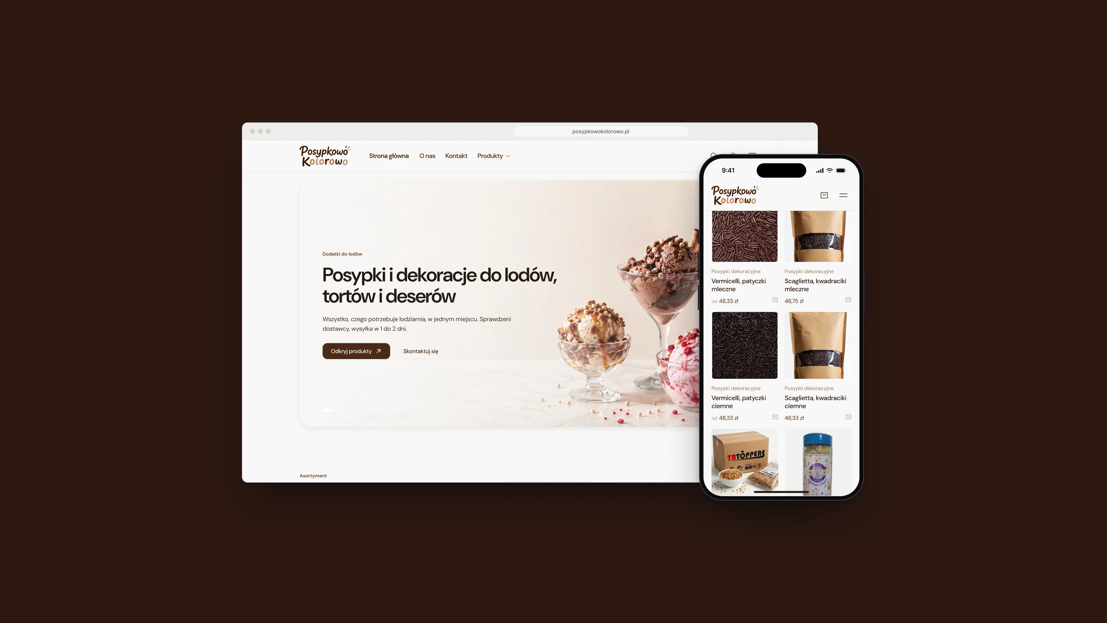
Posypkowo Kolorowo has supplied ice cream parlours with toppings, sauces and decorations since 2006. I designed its online shop: a catalogue of the whole range, product pages that sell by the pack, a basket that stays one tap away, and a checkout that fits on a single page.
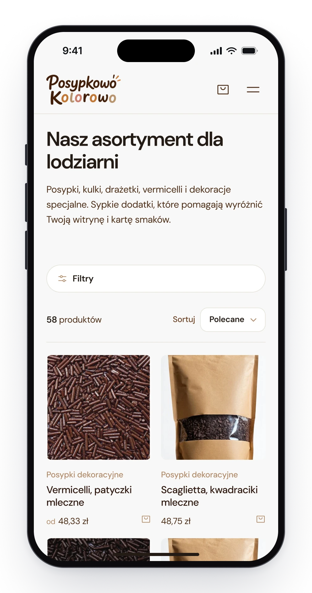
Fig. 01The home page, and the catalogue on a phone.
Notes
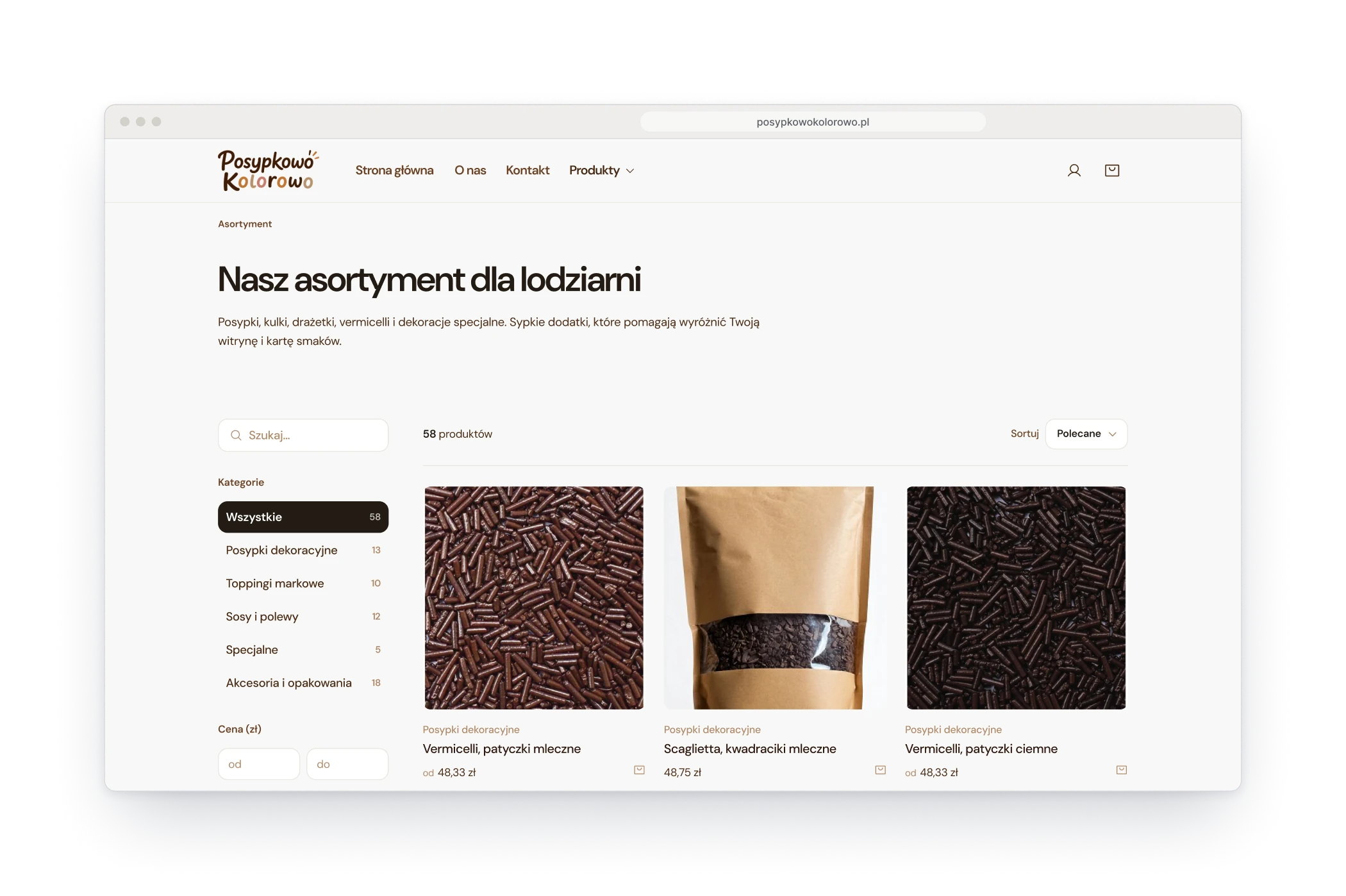
People who order here run a parlour, and they know what they came for. So the shop skips the persuasion and gets to the shelf: the catalogue opens on products with their prices, the categories on the side say how many items each one holds, and a topping can go into the basket straight from the list. The company's own story has its page, for those who want it.
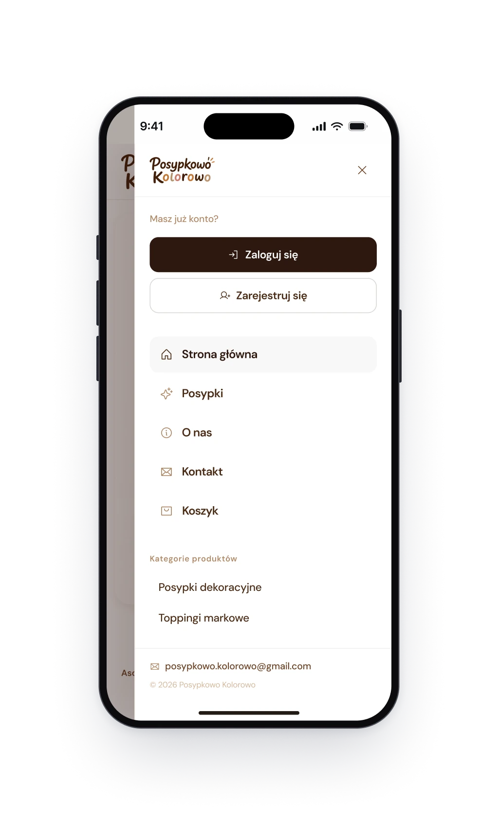
Fig. 02Left: the catalogue with its categories. Right: the menu on a phone.
Design decision
Every price sits on its pack
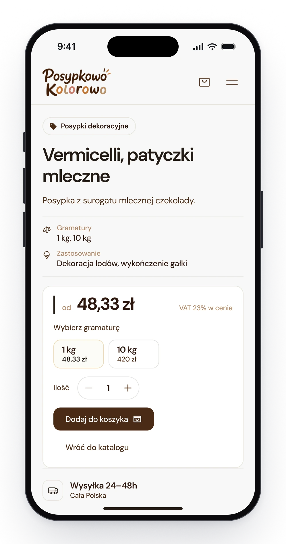
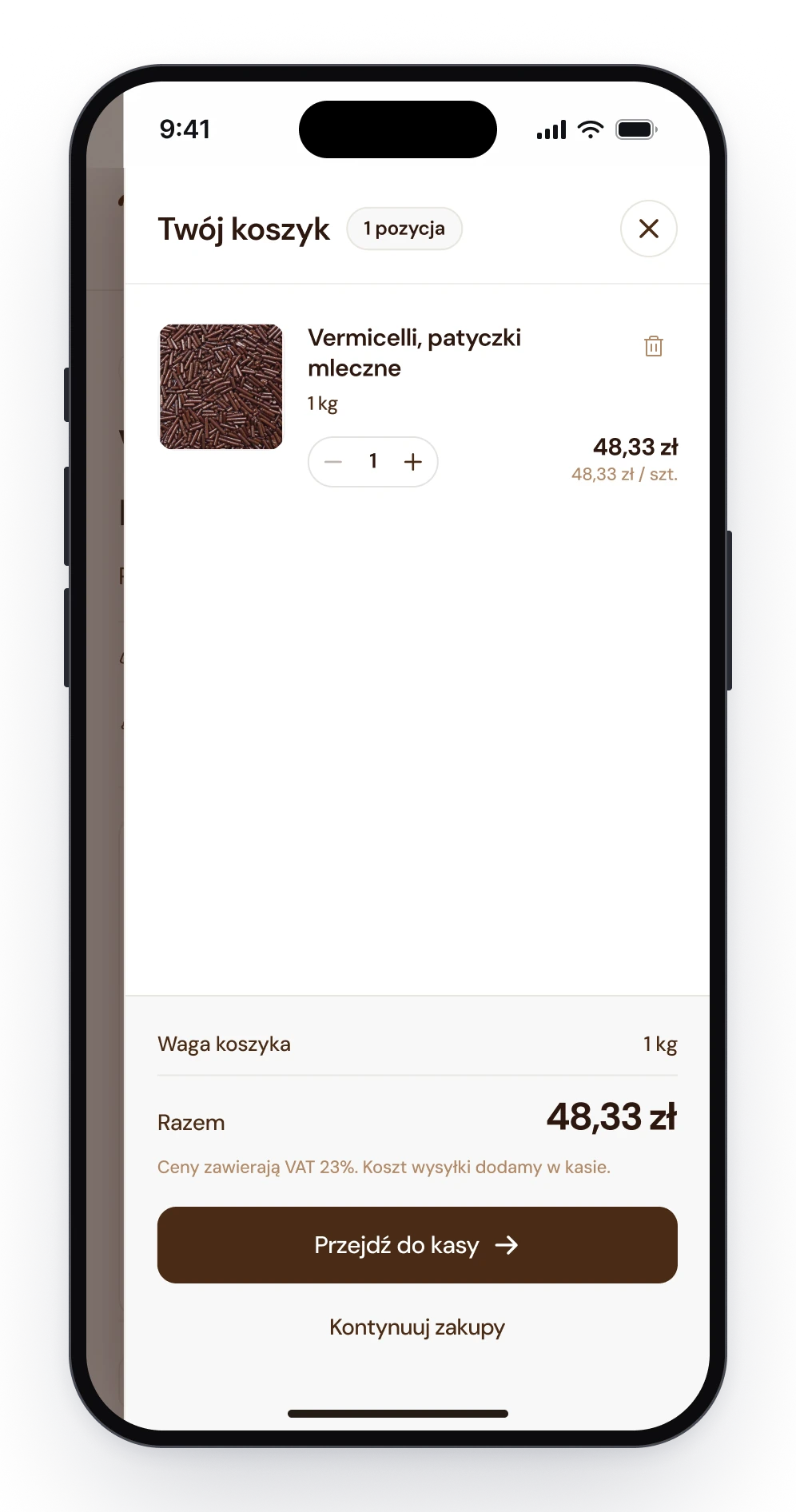
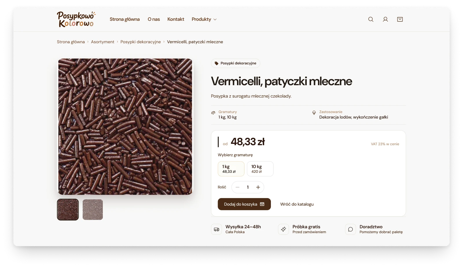
A parlour does not buy a topping, it buys a kilo of it, or a ten-kilo box. So the pack is the first choice on a product page, and each size shows what it costs before anything is added. The catalogue says where the price starts, and the basket adds up the weight of the order next to the total.
The catalogue shows where each price starts.
A product page: pick a pack, see its price.
The basket sums up the weight and the total.
Process
It started as a catalogue
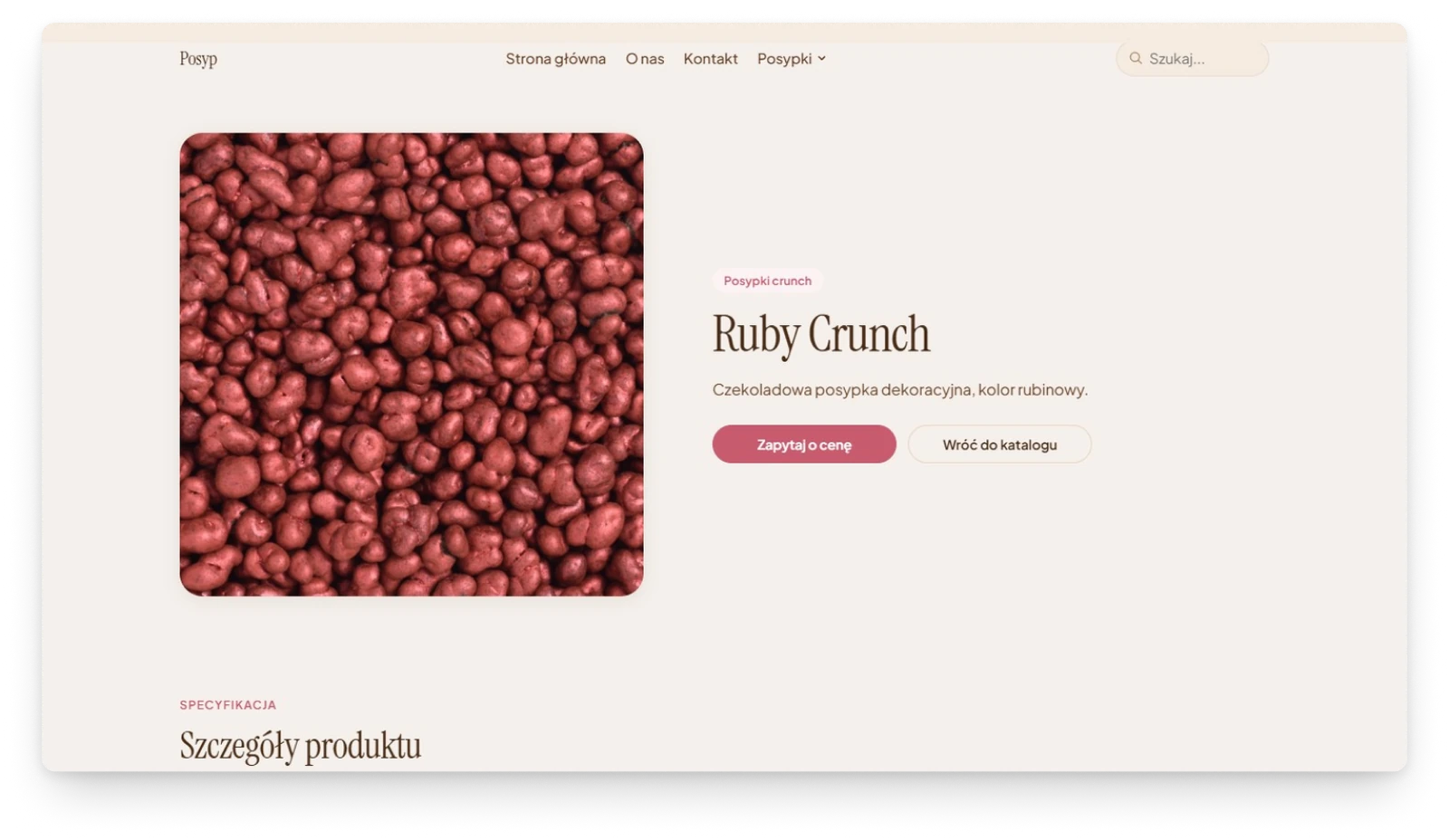
The first version of the site was a catalogue: a product page had a photograph, a name and one button, ask for the price. The shop turned that question into an answer. A product now opens with what it costs in each pack, and the order goes to a basket instead of an inbox.
Before: one button, ask for the price.
After: the price, the pack and the basket.
Components
One tile wherever a product appears
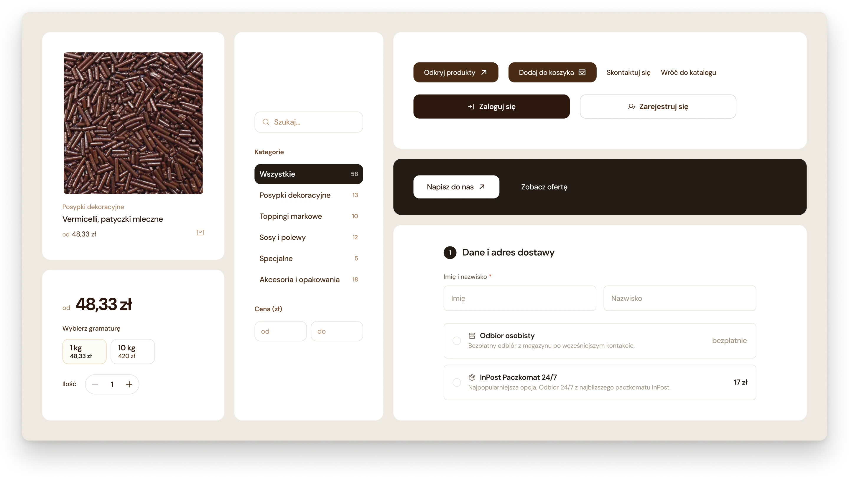
The shop is built from a small set of parts. A product looks the same on the home page, in the catalogue and under another product: its category, its name, its price and a small basket button. Buttons work in pairs: a filled one for the step that moves the order forward, and a quiet one for the way back.
A product tile, the pack picker, filters, buttons and checkout fields.
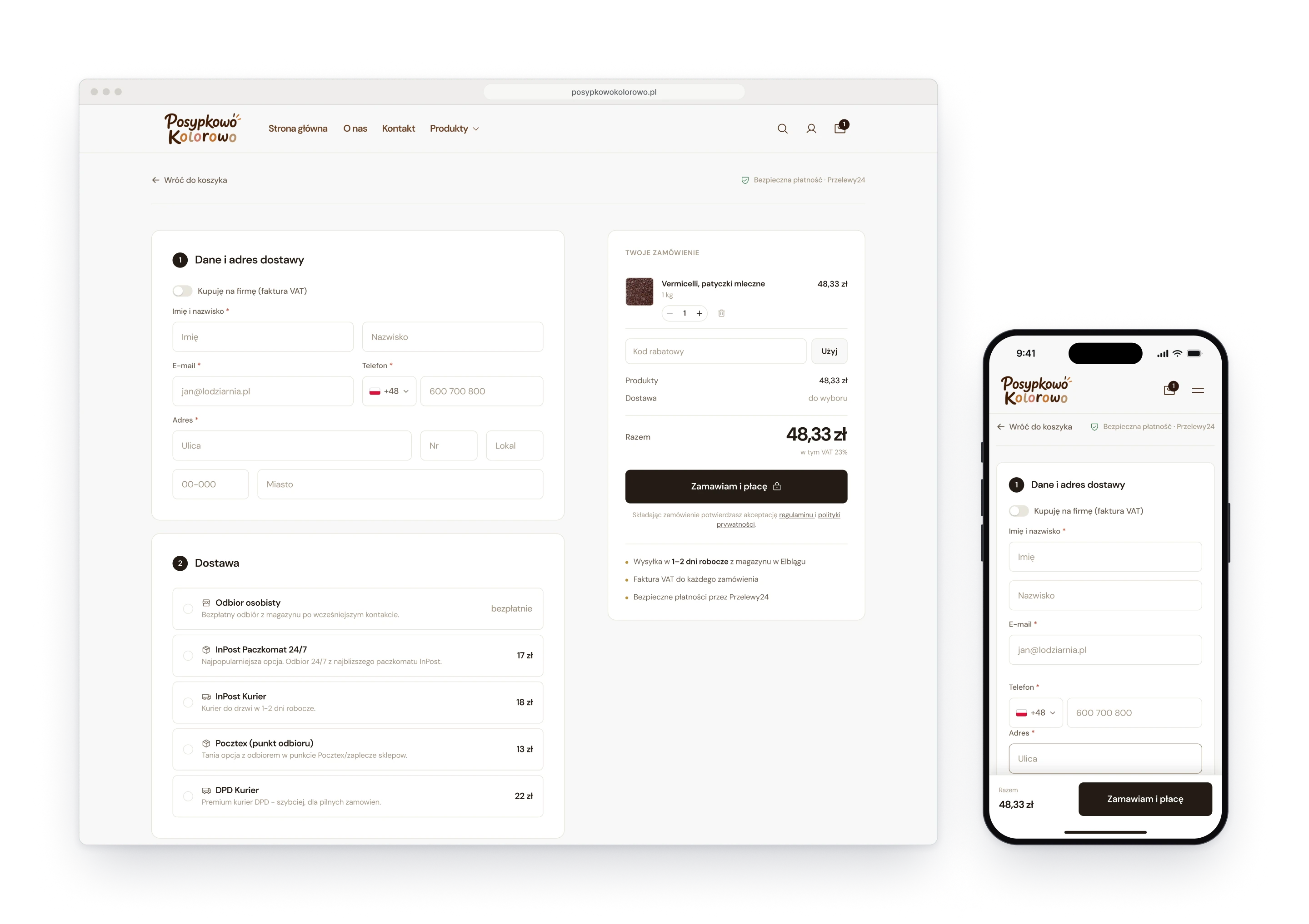
Fig. 03The checkout: one page, with the order summed up beside the form.