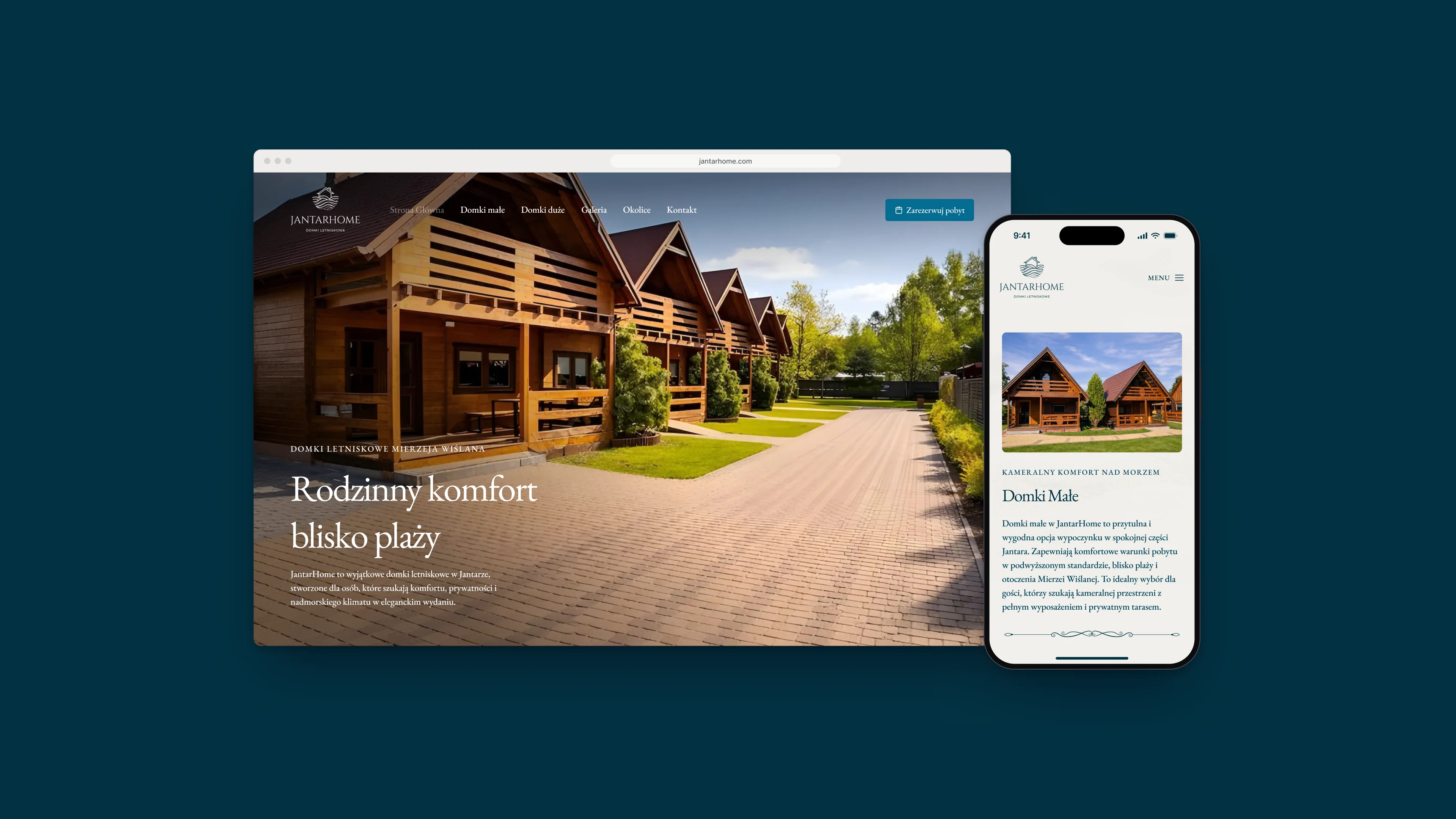
JantarHome rents seven holiday cottages in Jantar on the Vistula Spit, 700 metres from the beach. I designed its website: a page for each kind of cottage, a gallery, a guide to day trips nearby and a contact page that holds the price list.
Fig. 01The home page, and the small cottages on a phone.
Notes
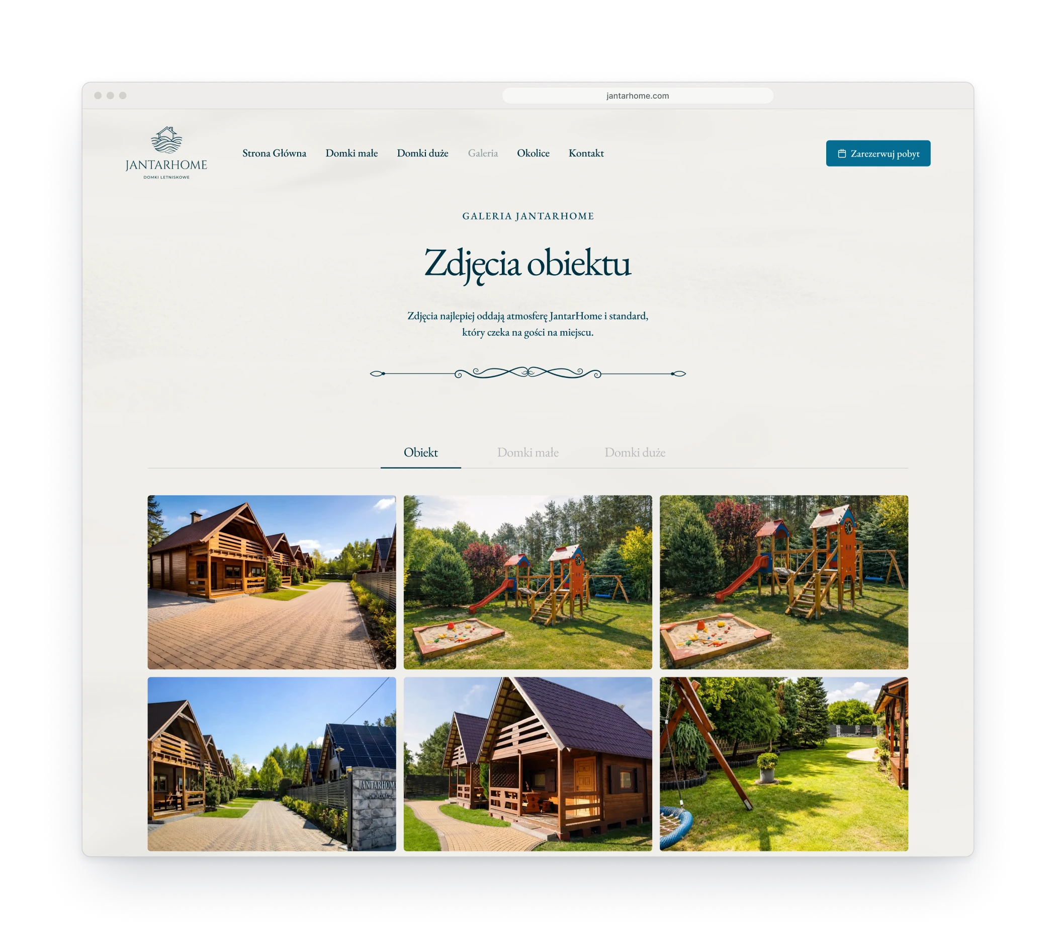
A holiday cottage is chosen with the eyes, so photographs lead on every page and the text stays short. After the pictures a guest checks three things: what is inside, how far the beach is and what a night costs. The site answers in that order and writes the price down, season by season. The look stays quiet, warm paper and sea navy with one drawn flourish, so the wood and the green in the photographs carry the colour.
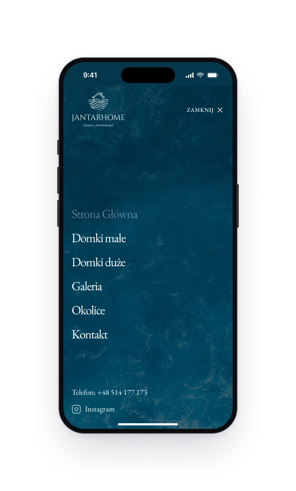
Fig. 02Left: the gallery, sorted into three tabs. Right: the navigation on a phone.
Design decision
Every button leads to one page
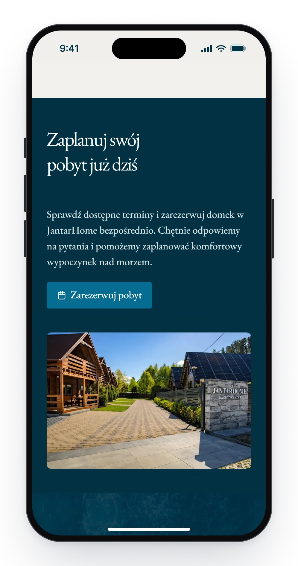
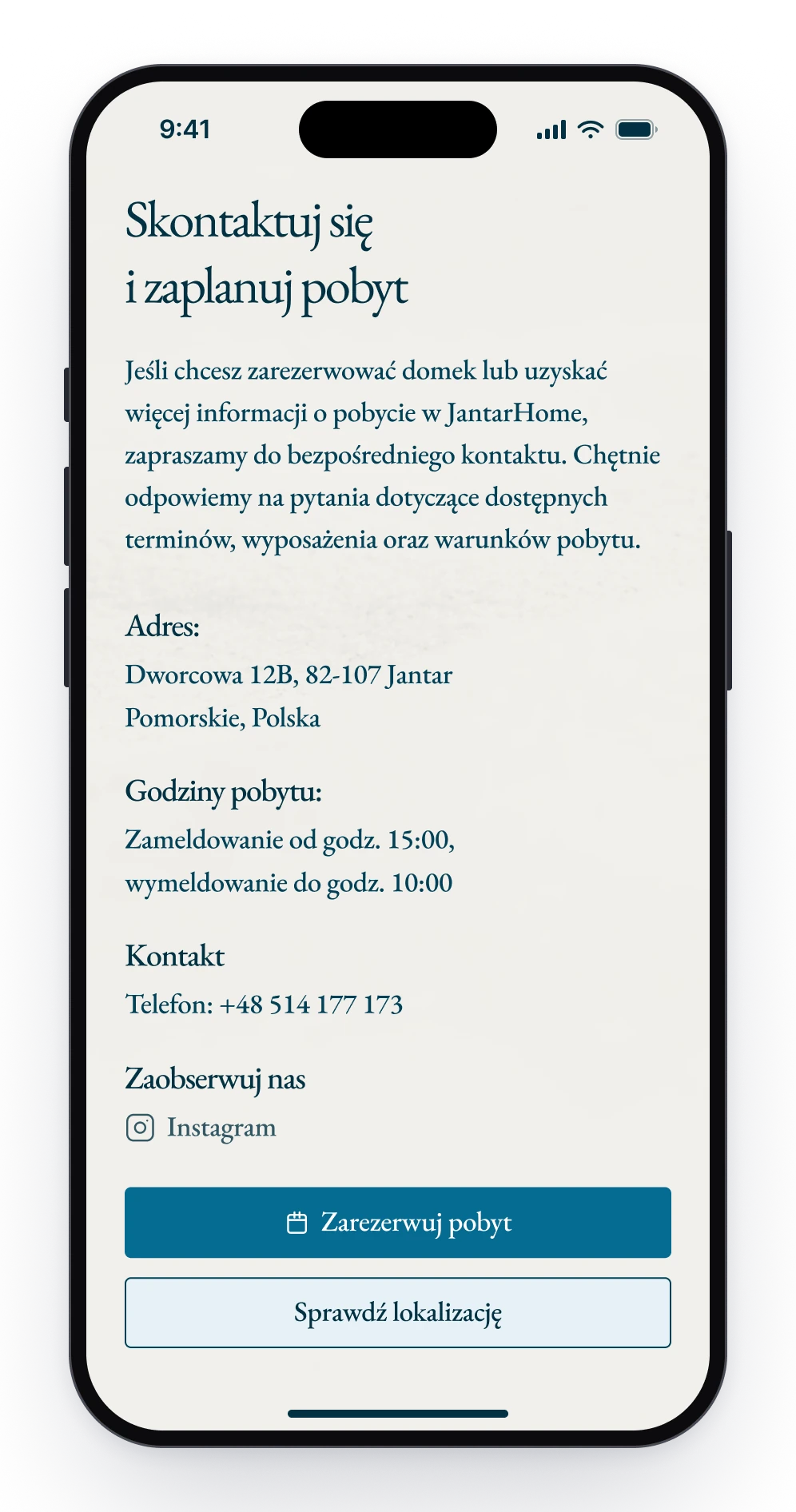
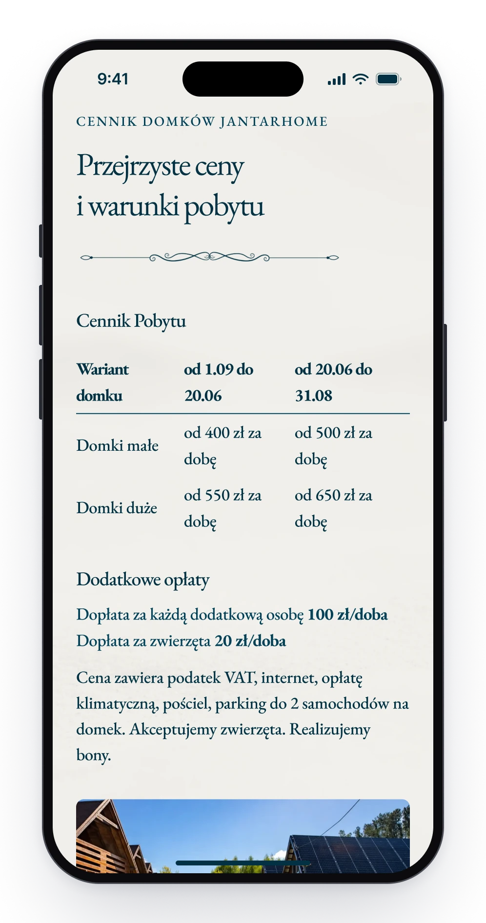
The owner takes bookings by phone, so every Book a stay button, in the header, on the home page and under each cottage, opens the same page. It holds the phone number, the address, the hours of arrival and departure and the full price list. By the time a guest calls, only the date is left to settle.
A cottage page ends with one button.
It opens the phone number, the address and the hours.
The price list sits on the same page.
Design decision
Two kinds of cottage, two pages alike
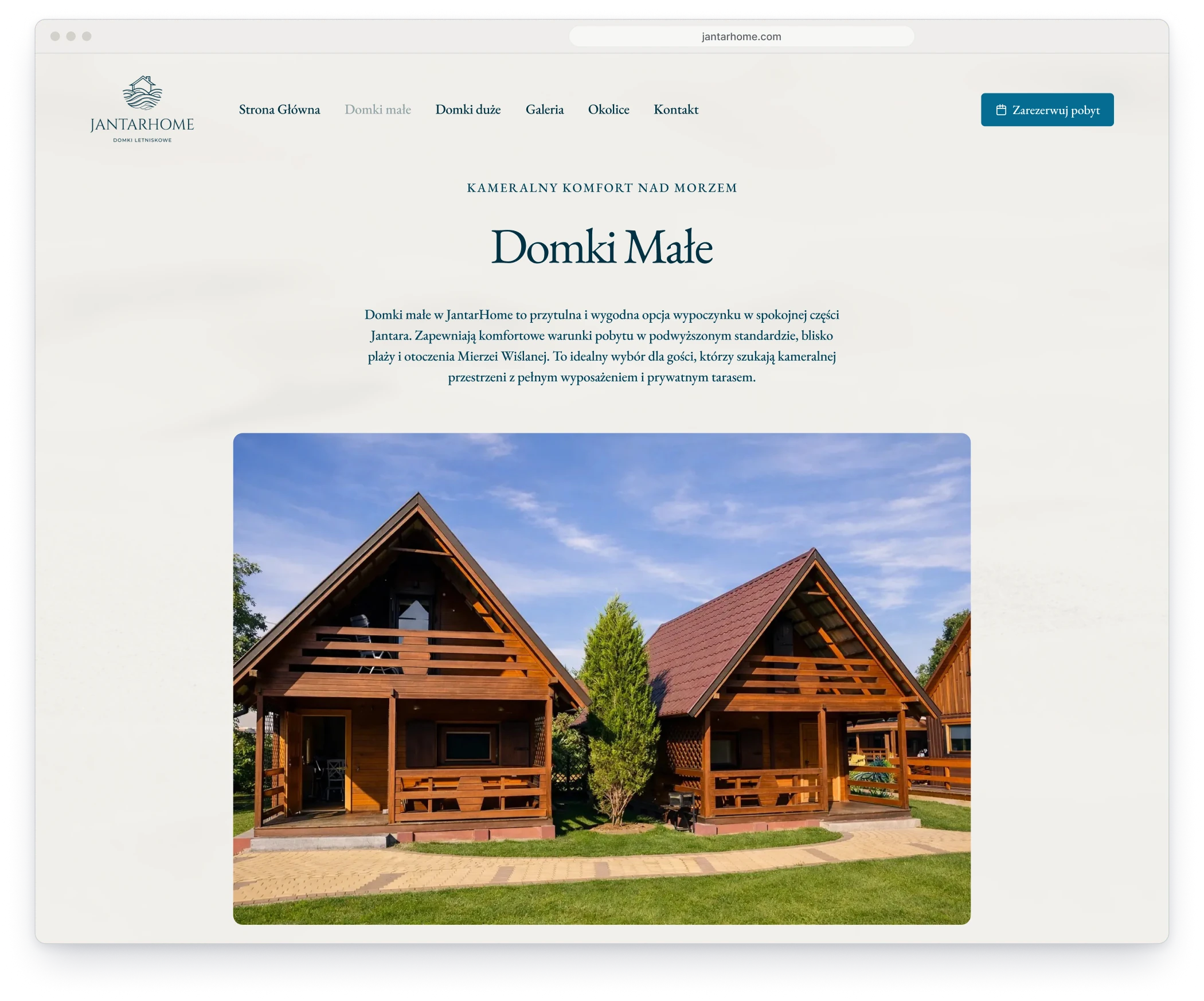
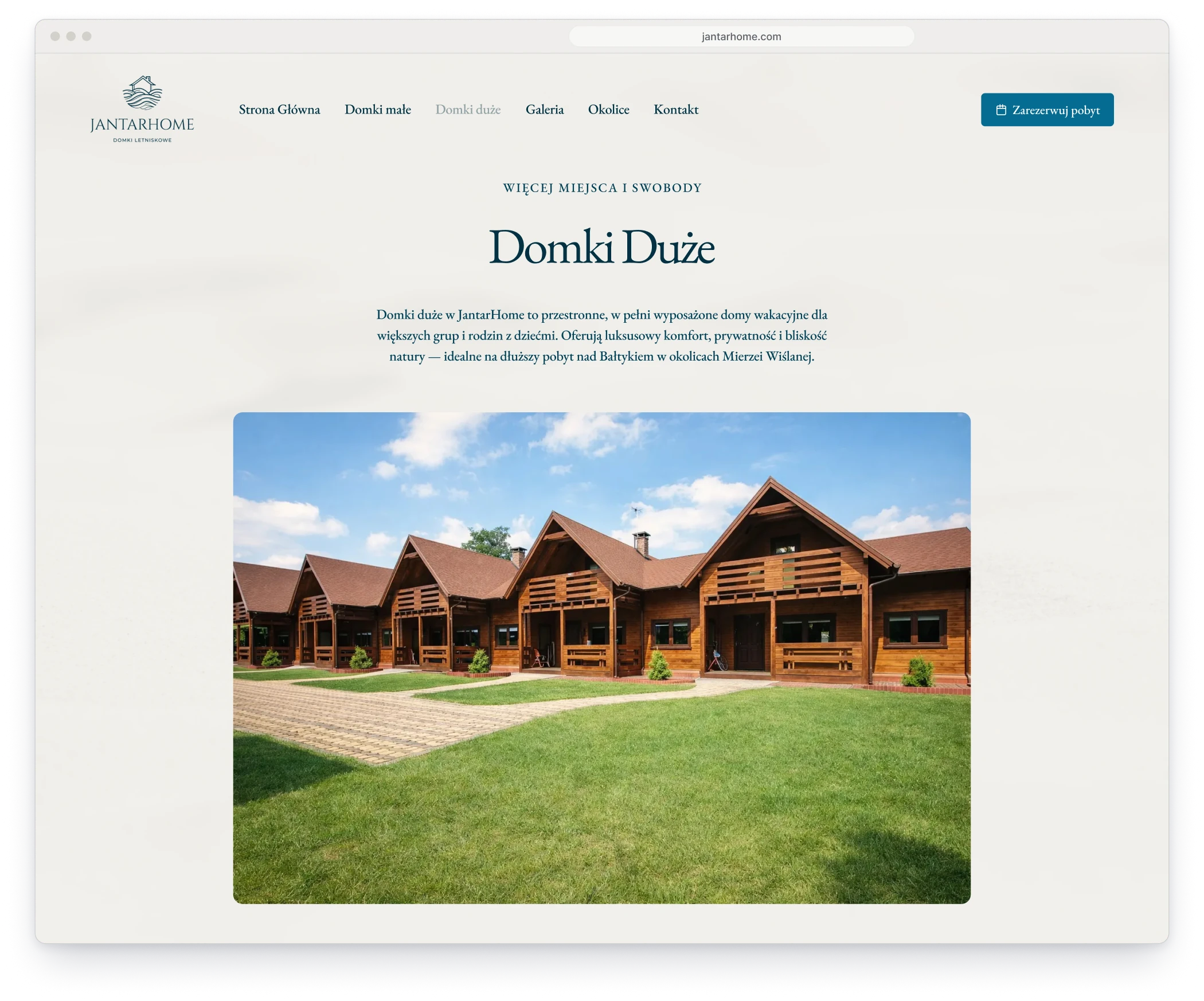
JantarHome has two kinds of cottage, and a family compares them before it calls. Each kind has its own page, built in the same order: the cottage from outside, the rooms inside, a strip of photographs, six things that matter on holiday and the booking. Read one, and you know where to look on the other.
Small cottages: a living room, a kitchen and bedrooms upstairs.
Large cottages: more bedrooms and a bigger living area.
Components
One flourish and a handful of parts
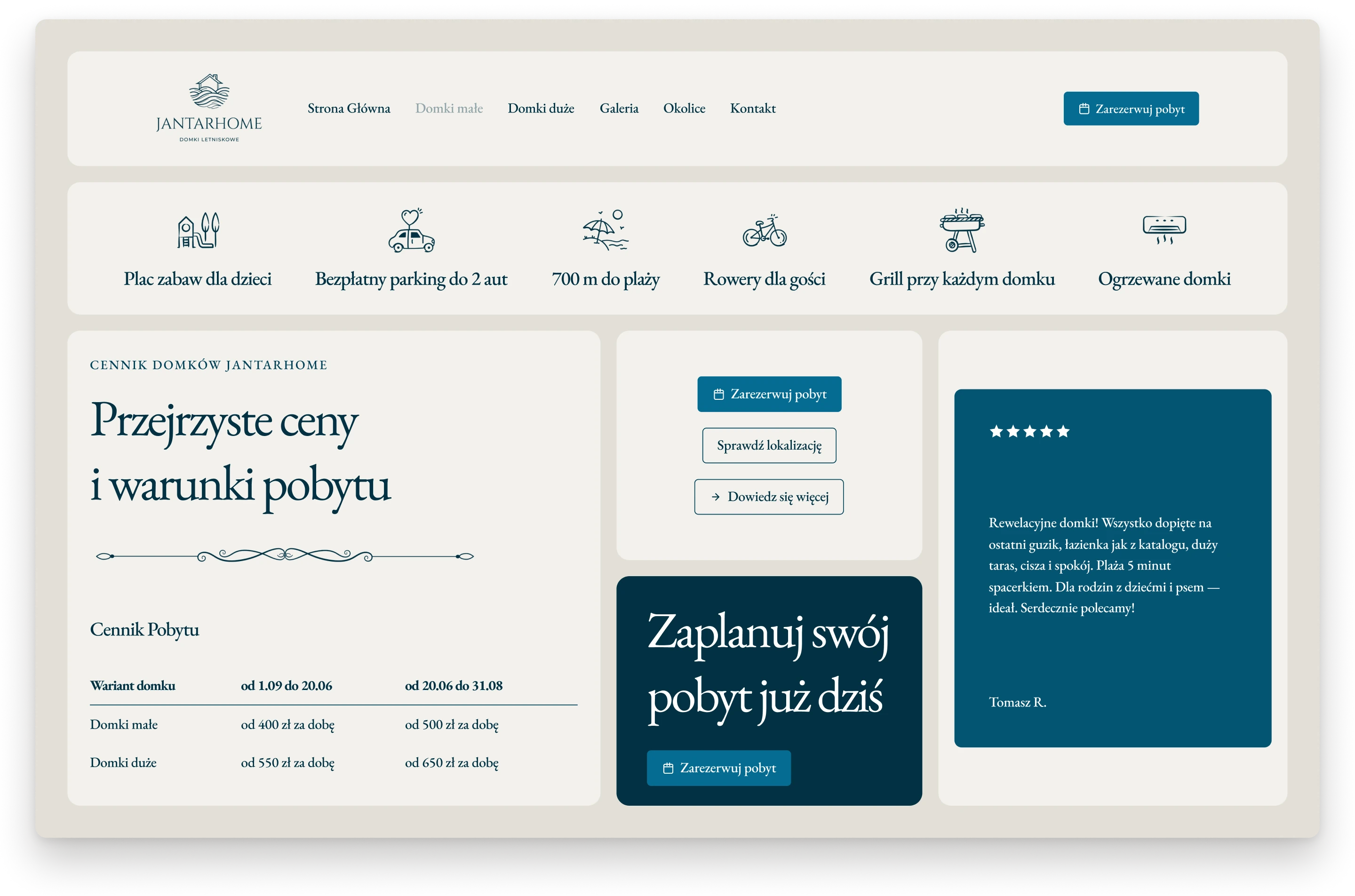
The site is built from a handful of parts. A drawn flourish closes every opening heading. Six line icons name what guests ask about first, from the walk to the beach to the parking. Two buttons do the work, a filled one for the main step and an outlined one for the rest. Reviews sit on cards in sea navy.
The navigation, six icons, a heading with its flourish above the price table, buttons and a review.
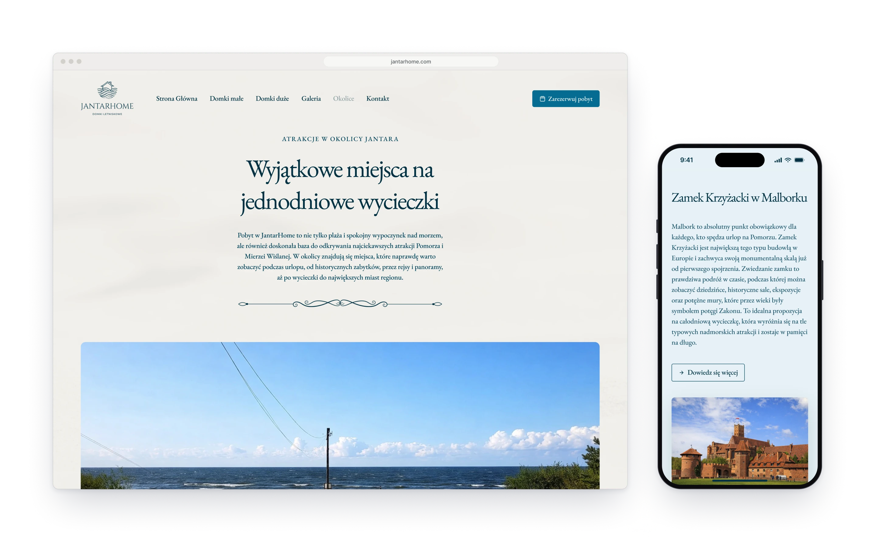
Fig. 03The surroundings page: day trips to Gdańsk, Malbork, Frombork and the Vistula Lagoon.