Polskie Innowatorium is a Warsaw team that films, photographs and promotes the work of innovators, Polish brands and public institutions. I designed its website: a page for each of the three, with projects on film, short reels, photo coverage and a contact form, in six languages from Polish to Arabic.
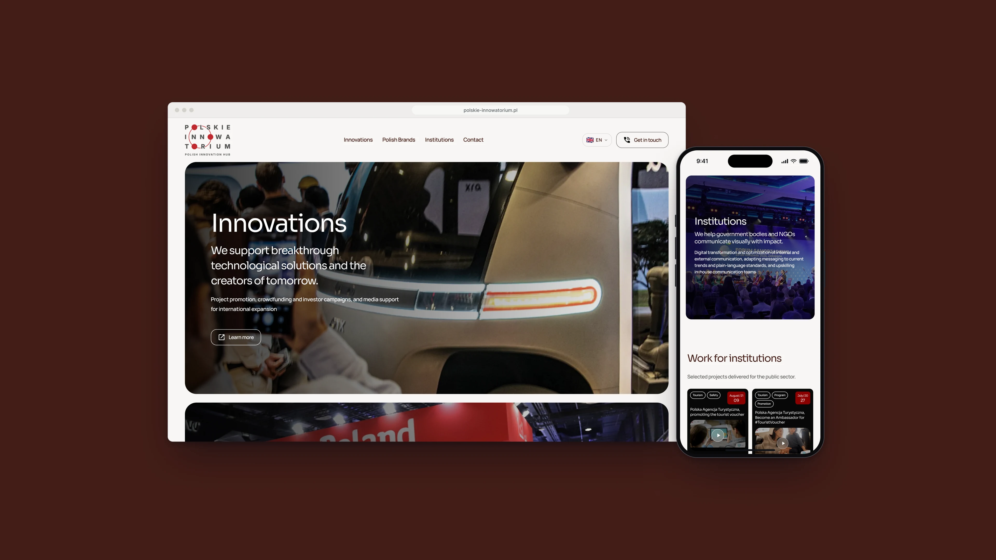
Fig. 01The home page, and the page for institutions on a phone.
Notes
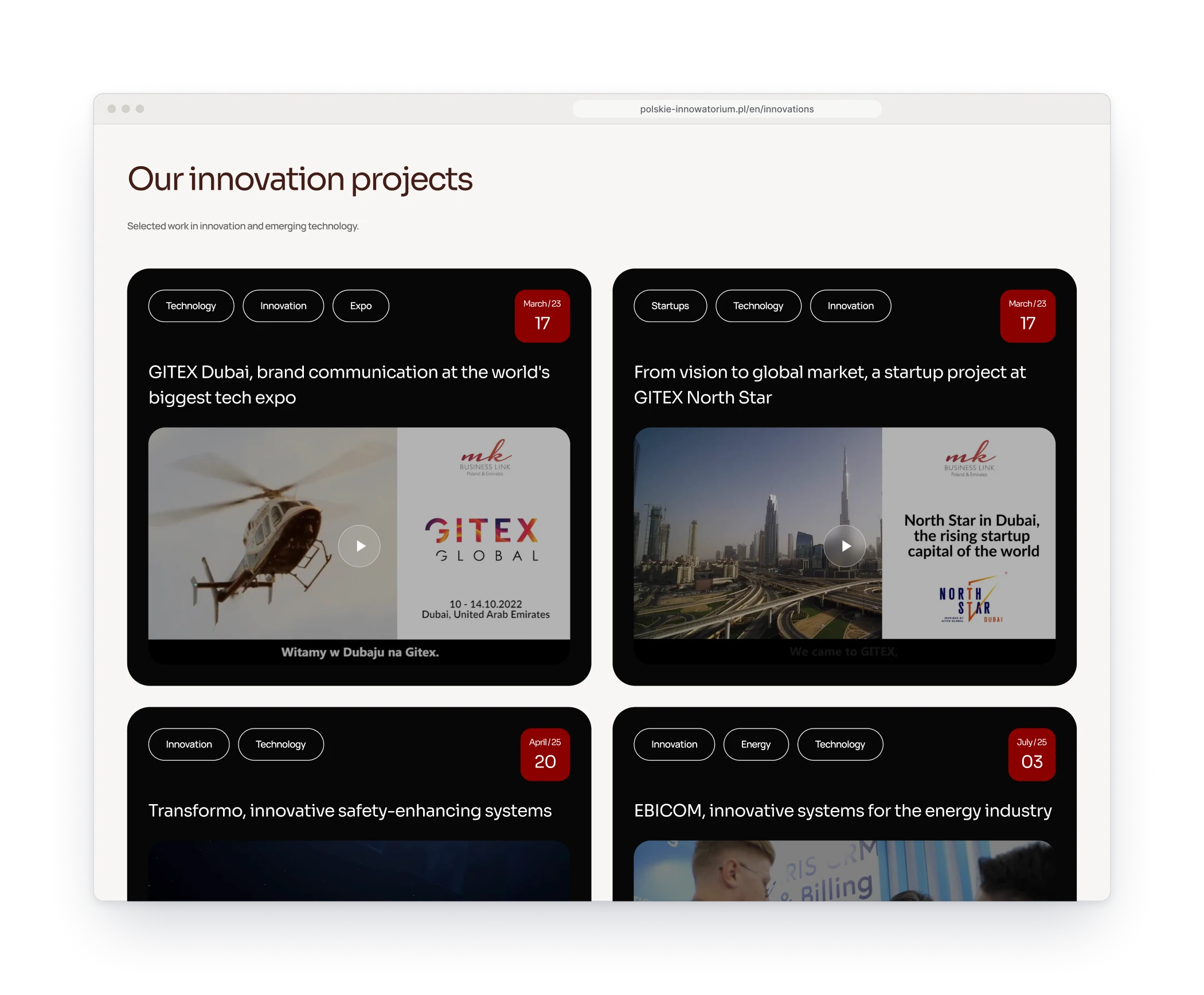
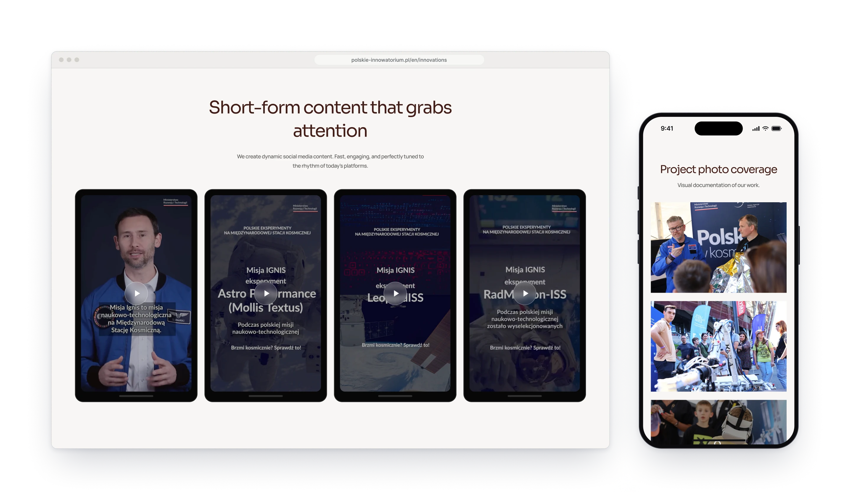
The team works for three very different clients, so the site greets each of them at its own door. The home page opens with three large cards, Innovations, Polish Brands and Institutions, each with its own photograph and promise, and each leads to a page with its own projects. The work itself is film, so the projects play as video, the reels stand in phone frames and the photo coverage follows them. The interface stays quiet and lets the footage carry the colour.
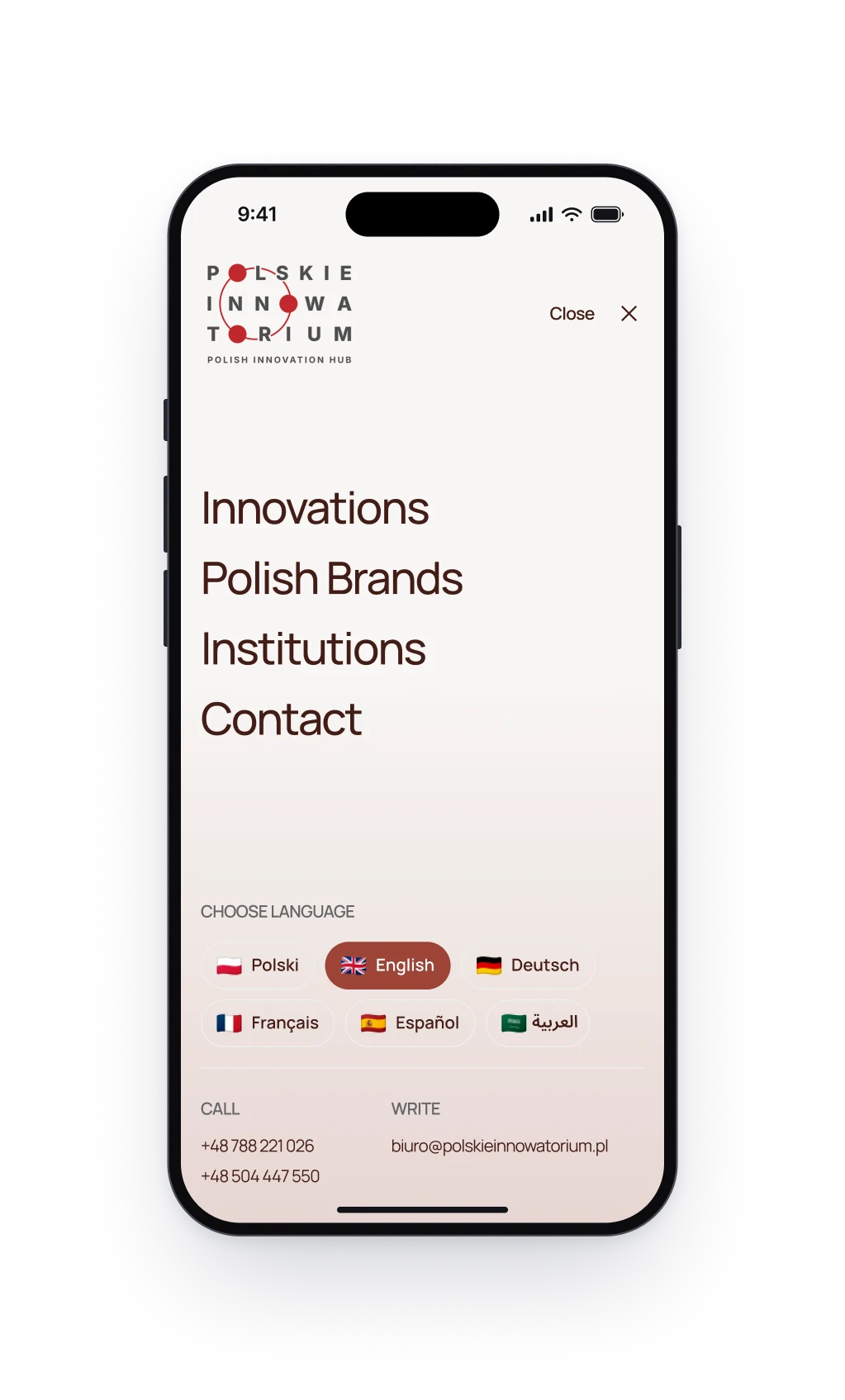
Fig. 02Left: every project plays as a film, each card dated. Right: the menu on a phone, with all six languages in reach.
Design decision
Twice the work on a phone screen
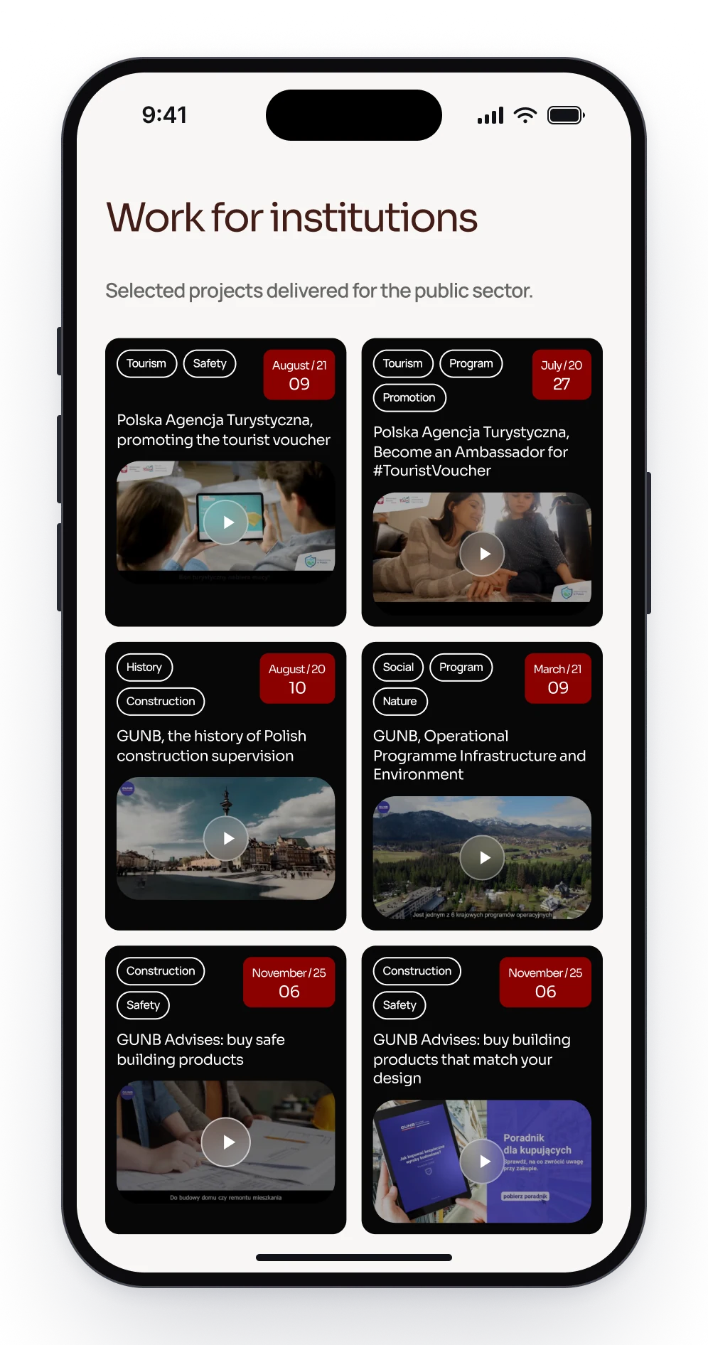
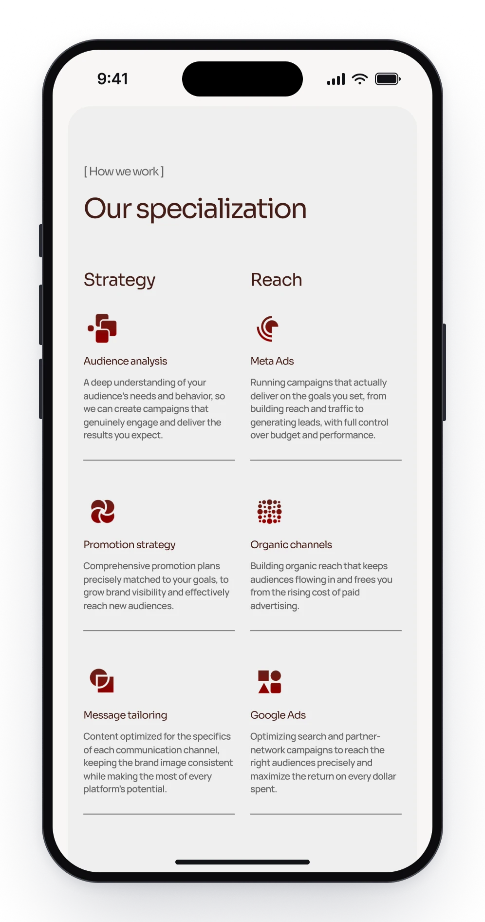
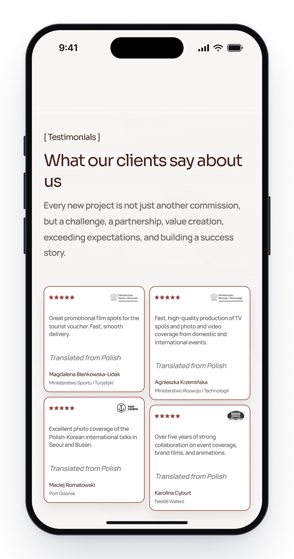
Across its three pages the team shows twenty-four projects, and in a single column a phone would turn them into a long scroll. On a narrow screen the project cards, the services and the client reviews run two to a row instead, so every screen holds twice as much.
Projects for institutions, two to a row.
The services side by side, Strategy next to Reach.
Client reviews, four to a screen.
Design decision
The same page, read from the right
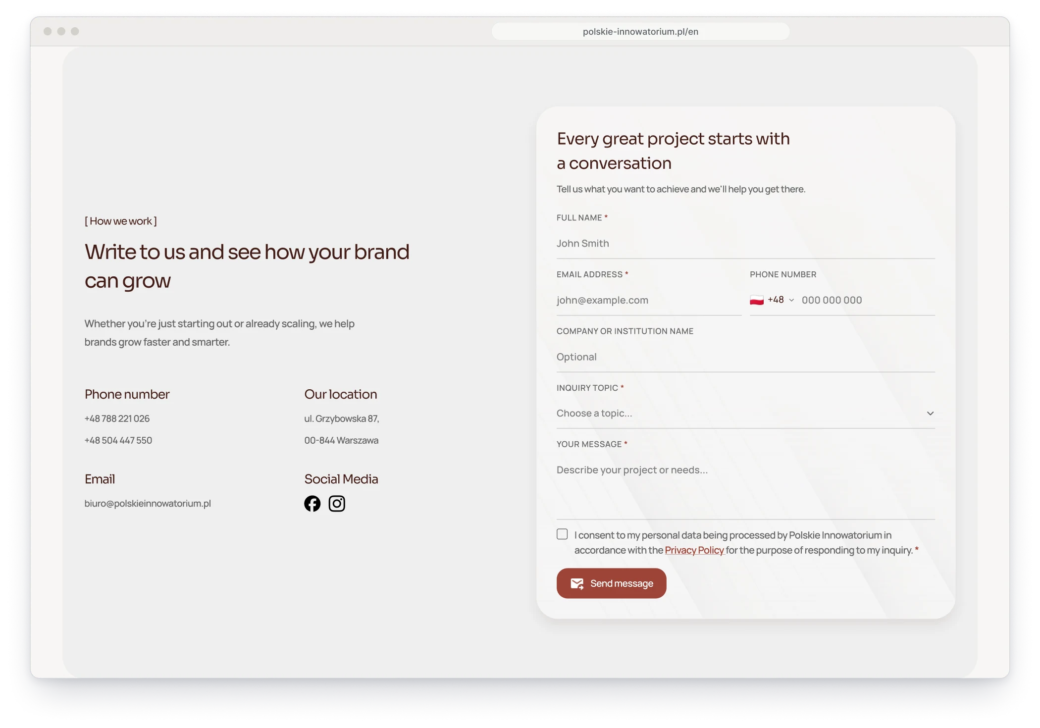
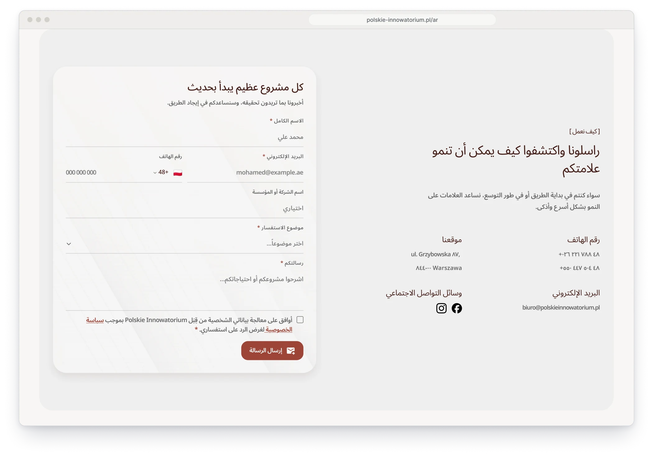
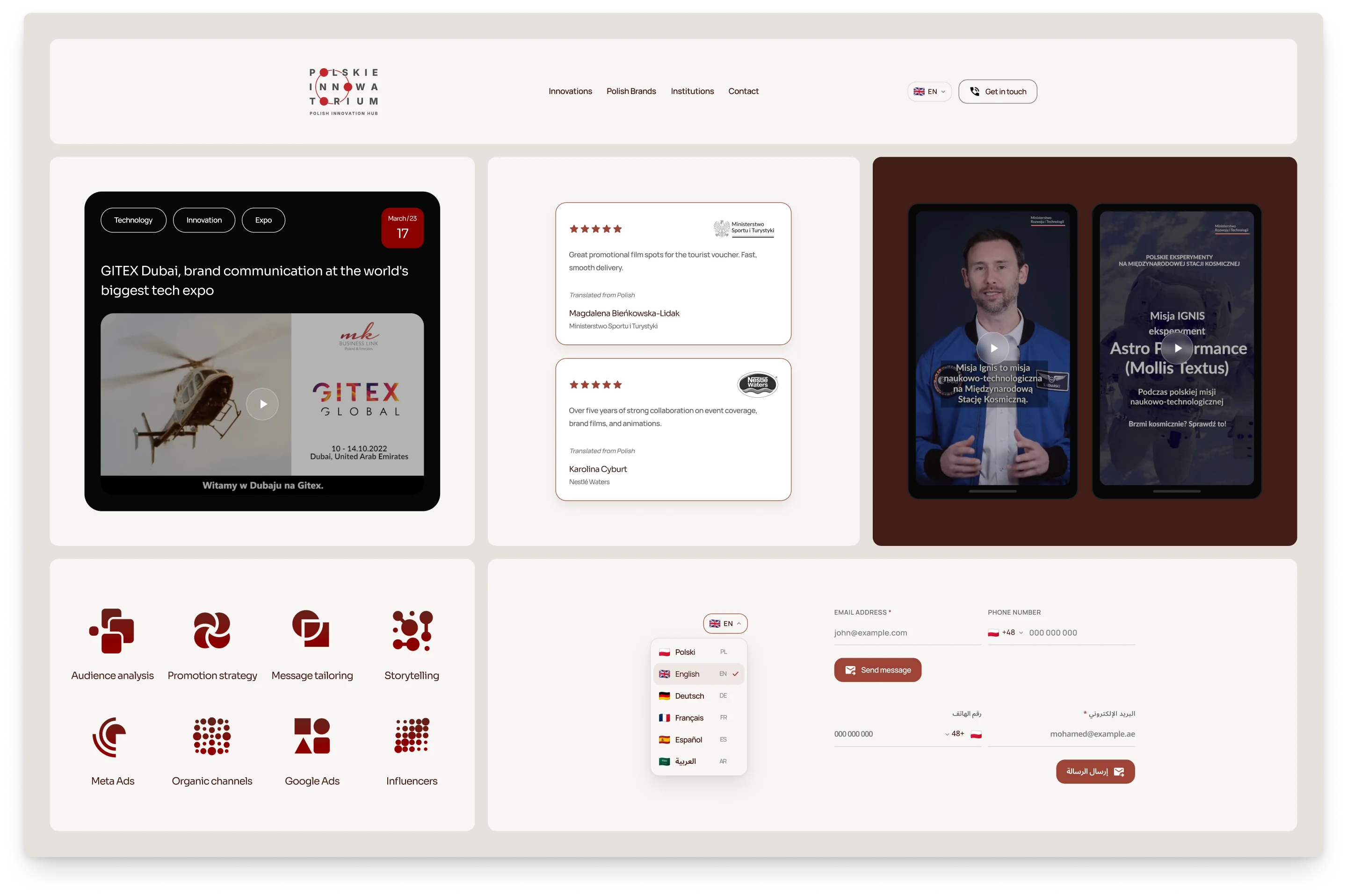
The team covers fairs and summits from the Emirates to Korea and Vietnam, so the site speaks six languages. In Arabic the whole layout turns around: the logo and the text move to the right, the form takes the left and the numbers switch to Arabic digits, while e-mail addresses still read left to right.
English: the text on the left, the form on the right.
Arabic: the same section, mirrored.
Components
Parts made for showing film
The site is built from a handful of parts. A dark project card holds its tags, a red date badge and the video. Reels stand in phone frames, reviews sit on white cards with the client's logo in grey, red geometric icons name the services and the language menu lists all six with their flags.
The navigation, a project card, reviews, reels, the service icons, the language menu and the form in both directions.
Fig. 03Short reels in phone frames, and the photo coverage on a phone.